Have you ever fallen to sleep during a PowerPoint presentation because you've been hit by walls of text, wizz-bang animations that send you dizzy and boring imagery?
Well, when the time comes for you to put together your next slide deck in PowerPoint, this post will put you on the front foot by using effective visuals to engage your audience and convey your message clearly.
TIP #1: USE GOOD QUALITY IMAGES
Images are much more effective than a wall of words. There are lots of places to find an image.


TIP #2: USE A COUNTDOWN TIMER
A timer helps set people's expectations.
Here are a few examples of where a timer could be used:

TIP #3: RULE OF THIRDS
This is a favourite tool used by professional photographers and designers. The rule goes along the lines of splitting your image into one third / two thirds, or one third / one third / one third.
Rather than placing an image in the middle of the frame, place it to one side. It's more aesthetically pleasing.
Here are some examples.


The rule of thirds is just a guide.
In this picture, the lady is in roughly half the picture, but could easily be moved a little off frame so that her face and hair took up one third.

TIP #4: DEPTH OF FIELD
Depth of Field is here the object in the foreground is in sharp focus and the background is blurred. In many cases it is also the other way around. For example, a tree in the foreground may be blurred while an object in the distance has the focus.
The blurred section of an image provides the perfect space to place text on top.

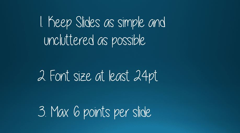
TIP #5: KEEP IT SIMPLE & CLEAR

TIP #6: CONTRAST
Always use contrast.
Make sure every audience member can clearly read the text.

TIP #7: SHADOW
To make text really stand out when placed on a background image:

TIP #8: DIMINISH THE BACKGROUND IMAGE
If you have the perfect image you wish to use, but you cannot clearly read your text when it is placed on top, instead of manipulating the text, try adapting the image. You don't even need Photoshop – you can do it directly in PowerPoint..
Let's say you start with this aerial image of the Gold Coast, Australia (my home city) and place your text on top.
This is how you can wash out the image to emphasise the text.
1. Select the image.
2. Click the Format tab under the PICTURE TOOLS at the top of the screen.
3. Click the Color icon and choose one of the washout options and optionally, go to the Corrections icon and make the image brighter.

Here are two examples, one using black and white washout and one using a colour washout.


Or you can use one on my favourite techniques …
TIP #9: OVERLAY
1. Keep your original image in full colour.
2. Draw a text box and type your text.
3. Switch off the borders of the text box.
4. Select Shape Fill then More Colors.
5. Choose a light colour, and then here's the important part …
6. Set the transparency to 50%. Depending on the image, you may need to set the transparency value higher or lower.

You can also add a full-size rectangle covering your entire image, choose your colour and set the transparency to different values to create the perfect combo for your image.
TIP #10: CUTE, FUNNY OR GEEKY
Inject some personality into your presentation. Turn the dullest, driest slide show into something memorable.
Let me introduce you to some simple Neuro-Linguistic Programming (NLP).
It doesn't matter what kind of a day you're having everyone feels good when they see a happy kid.
The image evokes a warm, positive emotion and opens up the neural pathways to receive (and retain) the message being presented.
Also, when someone is looking directly into the lens it draws you in. You find yourself leaning in and paying attention.

As a side point, notice:
Try not smiling when you see this image!
You could put any message (other than bad news) with this image and it would work.
It's a good way to break the tension/ boredom, enjoy a lighter moment and re-engage with your audience.

For anything techy, use a geeky image to lighten a heavy topic.

TIP #11: EMOTIONS & EXPRESSIONS
When you see someone expressing a particular emotion, it often invokes the same emotion in you.


TIP #12: LOOKING OR POINTING
Use pictures of people pointing, to draw attention to 'the thing' that you want your audience to see and remember.
Your eyes naturally go where somebody is looking or pointing, so use images to help bring attention to important elements. The internet has thousands of suitable stock photos you can download.
Here are some examples.


And on this final example, you can't see the board- it's a visual illusion - but you can insert any text into the white space below the image and because she's looking at it, you do too.

All the key points again
I hope you found plenty of value in this post. I'd love to hear your biggest takeaway in the comments below together with any questions you may have.
Have a fantastic day.


About the author
Jason Morrell
Jason Morrell is a professional trainer, consultant and course creator who lives on the glorious Gold Coast in Queensland, Australia.
He helps people of all levels unleash and leverage the power contained within Microsoft Office by delivering training, troubleshooting services and taking on client projects. He loves to simplify tricky concepts and provide helpful, proven, actionable advice that can be implemented for quick results.
Purely for amusement he sometimes talks about himself in the third person.
SHARE

