Some fonts are naturally positioned higher than others, and when you are mixing fonts or small graphics together the positioning may look awkward.
For example, in my training guides, keystrokes or button images are used a lot.
Here is a sample sentence. Notice how the bottom of TAB and ENTER sit on the baseline of the text.

After lowering TAB by 3pt and lowering ENTER by 5pt, here is the result. Notice how it flows more naturally.

To reposition text in relation to the baseline:
1. Select the text.
2. Select the Home tab.
3. Click the launcher in the bottom-right corner of the Font group.

4. Select the Advanced tab.
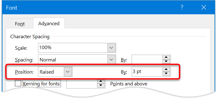
5. On the Position row, nudge the By arrows up or down.
When you increase the By value, Position will switch to Raised and your text will sit higher than its natural position.
When you decrease the By value, Position will switch to Lowered and your text will sit lower than its natural position.

Here are some other advanced text effects you may be interested in.
I hope you found plenty of value in this post. I'd love to hear your biggest takeaway in the comments below together with any questions you may have.
Have a fantastic day.


About the author
Jason Morrell
Jason Morrell is a professional trainer, consultant and course creator who lives on the glorious Gold Coast in Queensland, Australia.
He helps people of all levels unleash and leverage the power contained within Microsoft Office by delivering training, troubleshooting services and taking on client projects. He loves to simplify tricky concepts and provide helpful, proven, actionable advice that can be implemented for quick results.
Purely for amusement he sometimes talks about himself in the third person.
SHARE


Thanks this was very helpful!
No worries. Cheers Ed.