Funnels are commonly used to represent a diminishing flow.
A classic example is filtering candidates for a vacant job position.
Consider the following data. There are 200 applicants, of which 50 get invited to interview, 20 receive a second interview & assessment and 2 get hired.

1. How to create a funnel chart in Excel
To create a funnel chart to represent this data
1. Set up your data in two columns like the example shown above.
2. Ensure that the numerical data is sorted in descending order (use the Data tab | Z-A icon).
3. Select a single cell in your data to allow Excel to select the entire range or select the specific data range you wish to use.
4. Click the Insert tab.
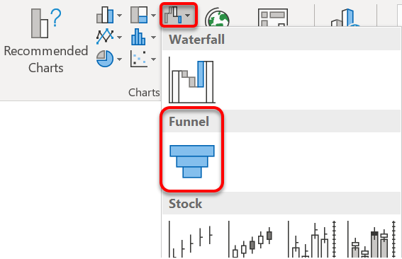
Click the Waterfall, Funnel, Stock, Surface, or Radar Chart icon in the Charts group, then choose Funnel.
Alternatively, click Recommended Charts | All Charts tab | Funnel Chart.

Your funnel chart will look similar to this:

2. How to change the text colour
To change the text colour:
1. Click any data label, go to the Home tab and select a suitable font colour.
3. How to overlay the data labels on the bars
To put the data labels on the funnel bars instead of to one side (if there is sufficient room:
1. Click on the top-right edge of the chart.
2. Choose Data Labels | More Data Label Options, then tick Category Name.
3. Click once on the existing axis labels and hit Delete.
I hope you found plenty of value in this post. I'd love to hear your biggest takeaway in the comments below together with any questions you may have.
Have a fantastic day.


About the author
Jason Morrell
Jason Morrell is a professional trainer, consultant and course creator who lives on the glorious Gold Coast in Queensland, Australia.
He helps people of all levels unleash and leverage the power contained within Microsoft Office by delivering training, troubleshooting services and taking on client projects. He loves to simplify tricky concepts and provide helpful, proven, actionable advice that can be implemented for quick results.
Purely for amusement he sometimes talks about himself in the third person.
SHARE

