Let's Dive Right In
Histograms are typically used in statistical analysis, in particular where the data falls into a conventional bell curve, with the larger frequencies of data in the middle range and the smaller frequencies of data on the outer edges.
There are 2 ways to create a histogram
- Use the standard chart feature.
- Use the Data Analysis Add-In.
Example Data
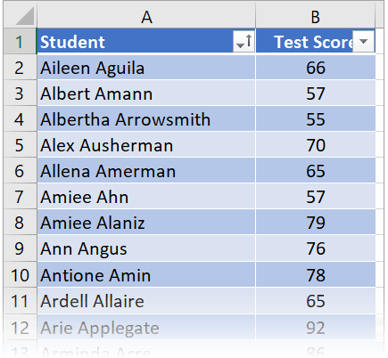
Consider this student data which is arranged in two columns, one for name and one for test score. The more data you have the more useful the histogram is.
To create a histogram chart using the chart feature:
1. Select a single cell in your data to select the entire range.
2. Select the Insert tab.
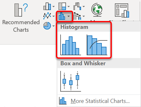
3. Click the Statistical chart icon in the Charts group, then choose Histogram.
Alternatively, go to the Recommended Charts | All Charts tab | Histogram.
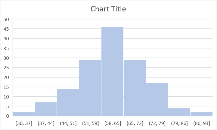
The initial chart looks like this.
Notice how it has broken up the data into 9 main numerical groups and displayed these in square brackets on the horizontal axis.
Numerical Bins
To set up the numerical bins
1. Double click one of the numerical data values on the bottom axis to display the sidebar.
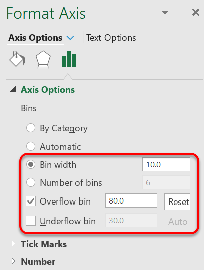
2. In the sidebar under Format Axis | Axis Options | Axis Options, either set the Bin Width to the size of the number group or set the Number of bins.
3. For the small values at either end of the bell curve, you can collect them together into one bucket by setting the values in the Overflow Bin and Underflow Bin.
In the settings (pictured right) the Overflow bin has been set to 80 so any score over 80 is collected into the final bin
Here’s how that plays out on the chart:
![[E2] 08 - 48 stat Histogram (Method 1: Regular Chart)](http://officemastery.com/wp-content/uploads/2020/03/E2-08-48-stat.png)
Gap Width
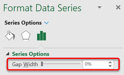
To change the gap width between columns
1. Double-click one of the histogram columns to display the sidebar.
2. In the sidebar under Format Data Series | Series Options | Series Options, set the Gap Width.
For no gap choose 0%.
Styling
It is always worth checking out the Chart Styles and Quick Layouts on the Chart Tools Design ribbon for different configurations. This provides a great styling start point. Customise from there.

I hope you found plenty of value in this post. I'd love to hear your biggest takeaway in the comments below together with any questions you may have.
Have a fantastic day.


About the author
Jason Morrell
Jason Morrell is a professional trainer, consultant and course creator who lives on the glorious Gold Coast in Queensland, Australia.
He helps people of all levels unleash and leverage the power contained within Microsoft Office by delivering training, troubleshooting services and taking on client projects. He loves to simplify tricky concepts and provide helpful, proven, actionable advice that can be implemented for quick results.
Purely for amusement he sometimes talks about himself in the third person.
SHARE

