While you can create a Histogram using Excel's standard chart feature, you can also create a frequency distribution using Excel's Data Analysis add-in tool.
And that's the focus of this post.
Example Data
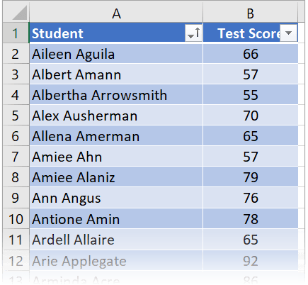
Consider this student data which is arranged in two columns, one for name and one for test score. The more data you have the more useful the histogram is.
Create the initial Histogram
To create a histogram using the Data Analysis add in:
1. Ensure you have the Data Analysis tool.
- Click the File tab, select Options and choose Add Ins.
- Click the Go button next to Manage Excel Add Ins.
- Tick the Analysis Toolpak and click OK.
- Return to your spreadsheet.
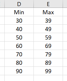
2. Create a simple table which contains your number buckets (bands) between the min and max values.
3. Click the Data tab | Data Analysis tool (right-hand side).
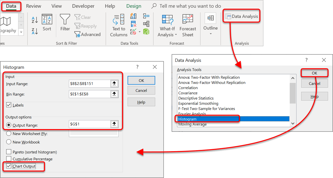
4. In the dialog, choose Histogram and click OK.
5. Set the Input Range to the numerical range in your original data.
6. For the Bin Range select the Max range, including the heading.
7. Tick the Labels box and the Chart Output box.
8. Select the Output Range option, then select the starting cell for your results.
9. Click OK. You now have a new data table and a Histogram.
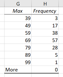
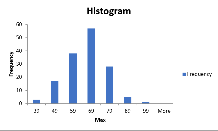
The histogram is functional, but quite bland. Plenty of room for improvement.
Make the labels more meaningful
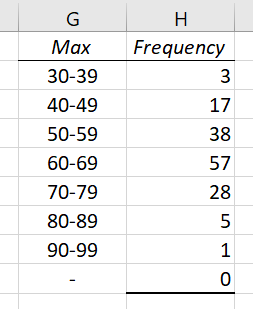
In the new data table adapt the values in the Max column to show a numerical range such as 30-39, 40-49 etc. Concatenation is the easiest method. Here’s the new formula for cell G2 in our example.
=D2 & "-" & E2
This is how the table now looks.
Customise the Histogram
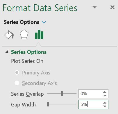
1. Double-click one of the Histogram columns to display the sidebar.
2. Reduce the Gap Width to 5% (or whatever your preference is).
3. Set the Series Overlap to 0%
4. Change the Horizontal axis label to Student Test Score.
5. Change the title to Frequency Distribution of Student Test Scores.
6. Remove the Legend.
7. Change the colours etc.
8. Remove the last column of the chart (which always says ‘More’) by clicking the Select Data icon on the Chart Tools Design ribbon, then reduce the current selection by one row.
9. If you want to combine the first two or last two columns of data because the numbers are so small, then make the adjustments manually, then set the data range ads you did in the last step. This achieves the same end result as the Overflow bins and Underflow bins when creating a Histogram as a standard chart type.

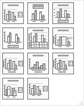
10. Play with the Chart Options gallery to check if there is a nicer design ...

11. … and the Quick Layouts to see if there is an option that shows your histogram data more effectively..
The final result
With a few quick tweaks, the Histogram / Frequency Distribution can evolve from …

to
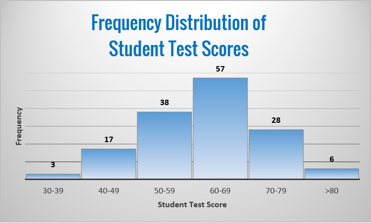
If you want to see a more detailed breakdown of your data, just create more numerical bins, then create a new frequency table and histogram using the Data Analysis Tool.
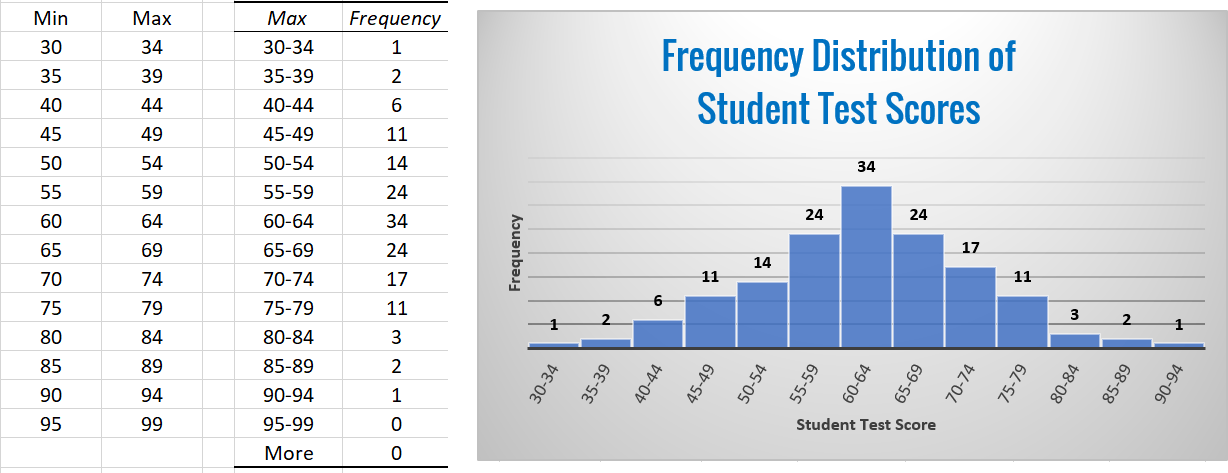
I hope you found plenty of value in this post. I'd love to hear your biggest takeaway in the comments below together with any questions you may have.
Have a fantastic day.


About the author
Jason Morrell
Jason Morrell is a professional trainer, consultant and course creator who lives on the glorious Gold Coast in Queensland, Australia.
He helps people of all levels unleash and leverage the power contained within Microsoft Office by delivering training, troubleshooting services and taking on client projects. He loves to simplify tricky concepts and provide helpful, proven, actionable advice that can be implemented for quick results.
Purely for amusement he sometimes talks about himself in the third person.
SHARE

