Beyond basic font formatting, there are lots of interesting ways to manipulate your text to achieve some great effects. STRETCHING, SPACING and KERNING are three easy techniques you can apply to items such as titles. You may also wish to add a WATERMARK, use GRAPHIC SEPARATORS or add a DROP CAP.
This post runs through the advanced text features offered by Microsoft Word and discusses how and why to use each one.
1. Superscript and Subscript text
Superscripted text is smaller than the text around it and is raised above the baseline. For example:
Subscripted text is smaller than the text around it and sits below the baseline. For example:
To apply superscript or subscript, first select the text then use one of these 3 methods.
Method 1: Use the ribbon icons
1. Select the Home tab.
2. Click the Superscript or Subscript icons in the Font group.
Method 2: Use font effects
1. Select the Home tab.
2. Click the launcher icon in the bottom-right corner of the Font group.

The Font dialog box is displayed. The Text Effects occupy the lower half of the box. Superscript and Subscript are two of the options.

Method 3: Use a shortcut key
The keyboard shortcut to superscript text is Ctrl Shift +
The keyboard shortcut to subscript text is Ctrl +
2. Stretching, spacing and positioning text with precision
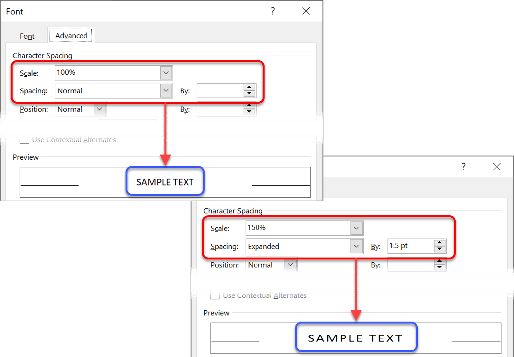
When creating a title, most people simply choose a large font size. While this is okay, as far as it goes, you can add a touch of professionalism by stretching or spacing the text. Both are found in the same dialog box.
1. Select the text.
2. Select the Home tab.
3. Click the launcher in the bottom-right of the Font group. The Font dialog box is displayed.
4. Select the Advanced tab.
To stretch the text
Click the Scale drop-down arrow and choose a larger percentage, or simply type the percentage you require. 100% is normal width, 200% is double width and so on.
To compact the text
Enter a smaller percentage in the Scale box. For example, 75% will compact the width to ¾ of normal size.
To add extra space between each letter (character) in the text
1. Choose Expanded from the Spacing drop-down list.
2. Enter a point size in the By box. For example, if you are using font size 20 and you expand the spacing by 10 points, you will add half a character width between each letter.
To make the letters fit tighter together
1. Choose Condensed from the Spacing drop-down list.
2. Enter a point size in the By box.
3. Raising or lowering text to re-align it
Some fonts are naturally positioned higher than others, and when you are mixing fonts or small graphics together the positioning might look awkward.
For example, in my training guides, keystrokes or button images are used a lot.
Here is a sample sentence. Notice how the bottom of TAB and ENTER sit on the baseline of the text.

After lowering TAB by 3pt and lowering ENTER by 5pt, here is the result. Notice how it flows more naturally.

To reposition text in relation to the baseline:
1. Select the text.
2. Select the Home tab.
3. Click the launcher in the bottom-right corner of the Font group.
4. Select the Advanced tab.
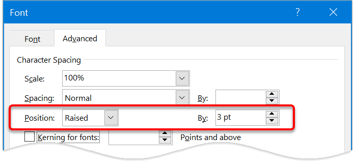
5. On the Position row, nudge the By arrows up or down.
When you increase the By value, Position will switch to Raised.
When you decrease the By value, Position will switch to Lowered.
4. Kerning
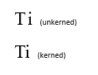
Kerning is a technique that was introduced with the printing presses in the 1800s. It recognises particular pairs of letters and positions them in such a way to make reading easier.
For example, an upper case ‘T’ followed by a lower case ‘i’ is kerned so that the ‘i’ almost sits underneath the bar of the ‘T’, rather than beside it.
Not every pair of letters should be kerned but there are hundreds of character pairs that are kerned by professional publishers and printers.
Word knows what to do. You just need to switch kerning on.
1. Select the text that you wish to kern (normally the whole document).
2. Select the Home tab.
3. Click the launcher in the bottom-right of the Font group. The Font dialog box is displayed.
4. Choose the Advanced tab.
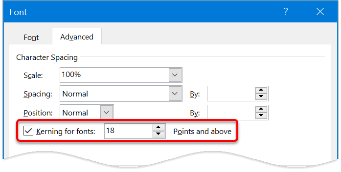
5. Tick the box labelled Kerning for fonts.
6. Specify a font size to be used as the cut-off point for the kerning. Any text of the specified point size and above will be kerned.
5. Ligatures and stylistic effects
Ligatures are two or more characters that are formed into a single character in order to create more readable or attractive text. Open Type fonts support four types of ligatures:
Modern Open Type fonts may come with a variety of stylistic sets available, but you often have to invest some time finding a good one. They may also come with different number-spacing options and number-form options.
Here is a sample of different combinations using the Gabriola font.
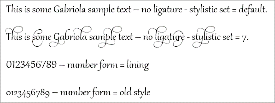
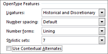
To experiment with ligatures, number-spacing, number-forms and stylistic sets:
1. Select the document text that you want to format.
2. Select the Home tab.
3. Click the launcher in the bottom-right of the Font group. The Font dialog box is displayed.
4. Choose the Advanced tab.
5. Select an option from each of the drop-down lists.
6. Working with old conventions - how big is a point?
Whenever you see a reference to font size, it is specified in points, e.g. font size 10, font size 12. What is 'point size'? How big is a point? Again, this is a historical convention that dates back to the 1800s.
There are 72 points in one inch.
Therefore, if you are using font size 12, the text size is 12/72 of an inch high when it is printed.
Put another way, 1 inch contains exactly 6 lines of size 12 text (6 x 12 = 72).
You never know when a fun fact like that might pop up in pub trivia quiz.
7. Adding a Drop Cap
A drop cap is where the first letter of the first word in the first paragraph is enlarged. A drop cap is usually added at the beginning of a new chapter or section.
This grabs the reader's attention and guides them to the beginning of the text.
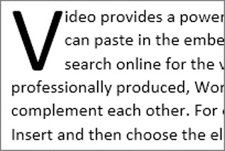
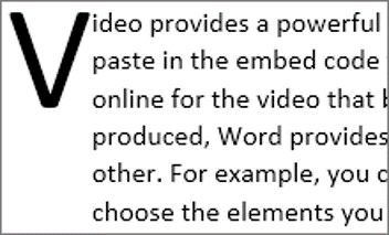
Drop caps are used in most novels and can easily be added to add a touch more professionalism to your document
1. Select the Insert tab.
2. Click the Drop Cap icon.
3. Choose the Dropped style or the In-Margin style.
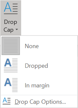
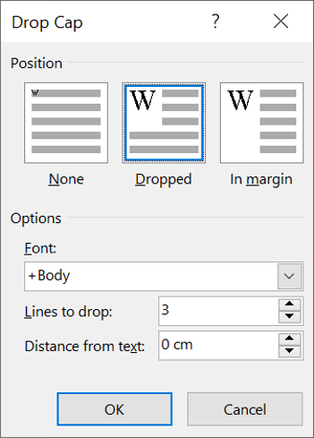
To change the settings, e.g. how many lines the drop cap should cover, click the Drop Cap Options in the menu.
8. Quick visual separators you can add with your keyboard
Type 3 dashes ( --- ) to display a single line separator
Type 3 equals signs ( === ) to display a double line separator
Type 3 hashes ( ### ) to display a triple line separator
Type 3 underscores ( ___ ) to display a thick separator
Type 3 asterisks ( *** ) to display a dotted line separator
Type 3 tildes ( ~~~ ) to display a wavy line separator
9. Many more amazing separators
There is also a Horizontal Line tool you can use.
1. Position the cursor where the line is to be inserted.
2. Select the Home tab | Paragraph group, or
Table Tools | Design tab (if you are working with a table).
3. Click the drop-down arrow on the Border icon.
4. Select Horizontal Line.
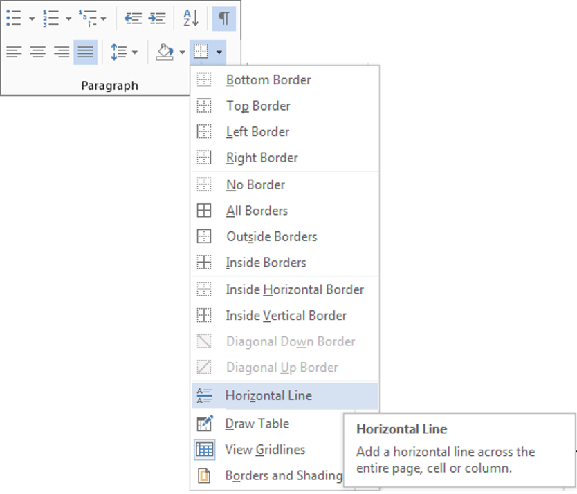
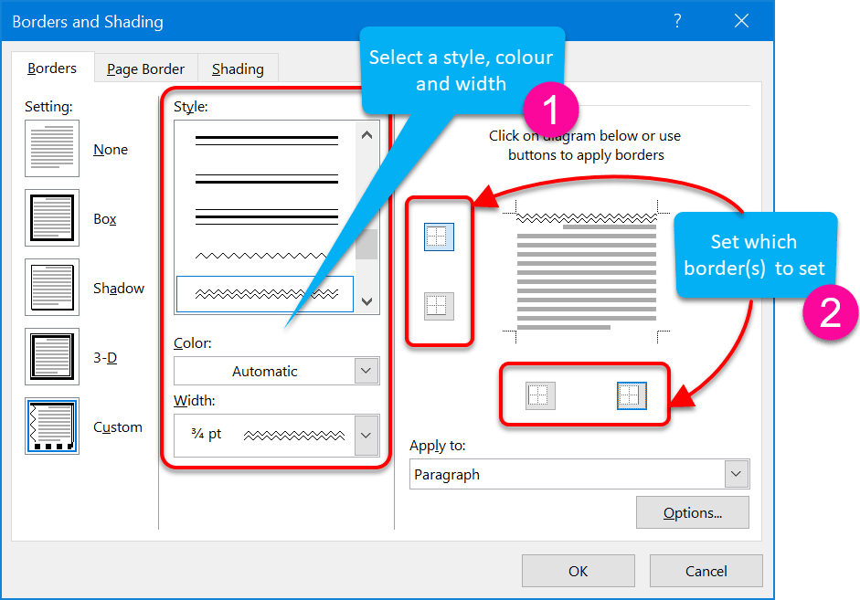
5. For more choices, click Borders and Shading instead of Horizontal LIne.
6. Choose a line style, line colour and line width.
7. Click the border icons around the preview so that only the top or bottom icon is on.
10. Using watermarks
A watermark is an image or item of text that appears in the background on every page, behind the text, and often full-page height. In the old days, you could buy watermarked paper from a stationer. The watermark was often an indication of status, e.g. Basildon Bond is a high-quality brand of stationery.
You can create a pre-designed watermark with a single click, and a customised watermark with just a little more effort. You can use text or images as a watermark.
#1 Standard text watermark
1. Select the Design tab.
2. Click the Watermark icon in the Page Background group.
3. Choose one of the pre-set designs in the gallery. The watermark is added instantly to the pages in the current document.
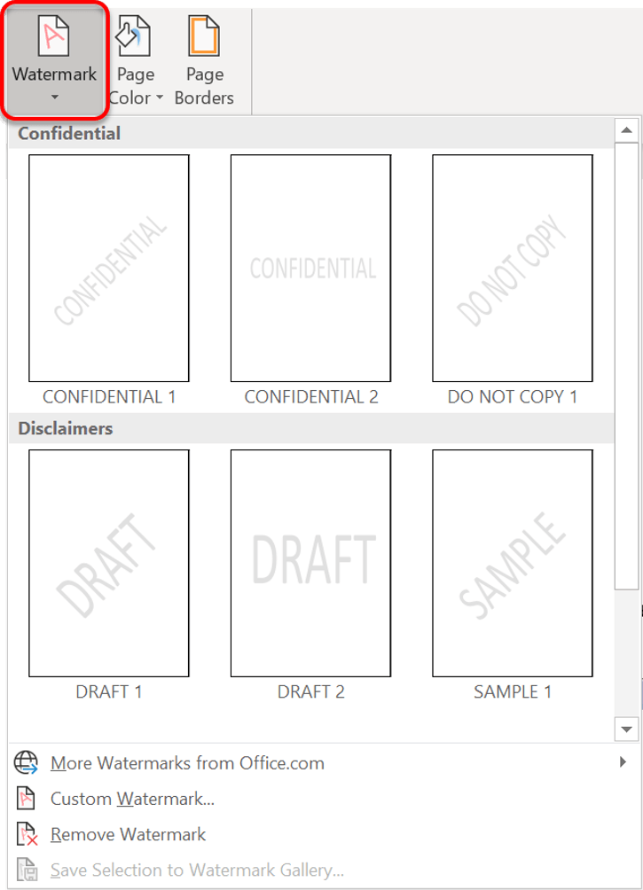
#2 custom text watermarks
To create a customised text watermark:
1. Select the Design tab.
2. Click the Watermark icon in the Page Background group.
3. Choose Custom Watermark... The Printed Watermark dialog box is displayed.
4. Choose the Text Watermark option.
5. Enter your watermark text in the Text box, and choose the font, size, colour and direction of the text. Leave the Semitransparent tick box ticked.
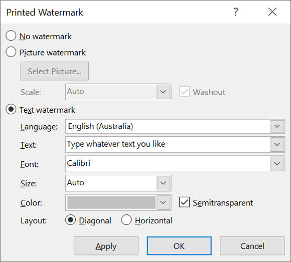
#3 custom image watermarks
To create a customised text watermark:
1. Select the Design tab.
2. Click the Watermark icon in the Page Background group.
3. Choose Custom Watermark... The Printed Watermark dialog box is displayed.
4. Choose the Picture Watermark option.
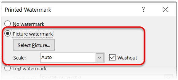
5. Click the Select Picture... button.
6. Locate and select your image.
7. Tick the Washout box, if you want.
8. Choose a Scale option to resize the image if you want.
9. Click OK
To edit the watermark image or text:
1. Double-click inside the header or footer area.
2. Select the Design tab under the Header & Footer Tools banner, if necessary.
3. Untick the Show Document Text option in the Options group.
4. The watermark image or text (WordArt) can now be selected, resized or manipulated in any way you want.
5. Click the Close Header and Footer icon in the Close group.
To switch off the watermark:
1. Select the Page Layout tab.
2. Click the Watermark icon in the Page Background group.
3. Choose Remove Watermark.
11. Adding a side banner to your pages
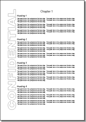
Sometimes, rather than a watermark, you may wish to add a banner down one side of the document, on every page. The technique is similar to adding a watermark, but everything is done through the header and footer.
1. Double-click inside the header area of the page (the top margin area).
2. Select the Design tab under the Header & Footer Tools banner, if necessary.
3. Untick the Show Document Text option in the Options group.
4. Insert a WordArt with the required text.
5. Rotate the text 90 degrees to display it vertically.
6. Stretch the WordArt image to full page height and position to the left, or the right side of the page.
7. Set the Word Wrapping of the WordArt to Square. This prevents the document text from overlapping the WordArt text.
8. Click the Close Header and Footer icon in the Close group.
12. Key Takeaways
In what interesting ways have you used these advanced text effects? Share in the comments below.
I hope you found plenty of value in this post. I'd love to hear your biggest takeaway in the comments below together with any questions you may have.
Have a fantastic day.

About the author
Jason Morrell
Jason Morrell is a professional trainer, consultant and course creator who lives on the glorious Gold Coast in Queensland, Australia.
He helps people of all levels unleash and leverage the power contained within Microsoft Office by delivering training, troubleshooting services and taking on client projects. He loves to simplify tricky concepts and provide helpful, proven, actionable advice that can be implemented for quick results.
Purely for amusement he sometimes talks about himself in the third person.
SHARE


Thank you Jason. I learned a few things about kerning and ligatures. But, I had a question that I thought you may be able to help. I can’t seem to find the answer elsewhere online.
I have created a character style called “button” where the font has a border around the word. You have a similar effect in item #3 above, with your “Tab” and “OK” buttons and it appears perfectly. I can not get this effect and my buttons are squished closed to the border.
So, my question is, how do I “add space” both before the first character and after the last character (not in between the characters, as would be the case with expanded font spacing). My style shows the left border nearly on top of the first character and I’d like maybe 3 or more spaces in advance so that the word is properly centered on the button.
Any help would be great. Thanks.
TC
PS: I can “hack” this by manually “adding extra spaces” as needed. But, then MS Word thinks there is a spelling error. I’m looking for a way to change the font style so that it happens automatically when the character style is changed.
Hi TC. Okay, first, let me deliver the bad news before I make a couple of suggestions.
The effects you see in point #3 above were created like this. The Tab was created by downloading a free Keystroke font then inserting the appropriate symbol from that font. The OK button is a screen capture directly from the Word dialog box. The sentence you see boked in point #3 above is a quick screenshot of the finished sentence from the document.
Unfortunately, you cannot create a style to add a box around a word or phrase. The character styling applies to the individual characters. The paragraph styling is what you need to add a border and control the indentation (which would be used for padding within your button). So it’s not a solution.
The closest thing I can come up with is this (and I hesitate because it’s not simple, neat or scaleable and takes a bit of time to set up):
1. Insert a textbox or a rounded rectangle, whatever takes your fancy. Draw the shape and type your text. Format the border and colours as necessary.
2. Click the text Wrap icon on the shape. If you choose ‘In line with text’ you can insert it inline, but it sits on the baseline and looks rubbish. If you choose ‘Tight’ you can move it wherever you want within your text but you’ll probably have to increase your
line spacing significantly so that it doesn’t look out of place.
You also cannot reduce the spacing between the border of the button and the text. To get around this:
1. Draw a button using a shape from the shapes gallery.
2. Draw a text box and type your text.
3. Superimpose the text on top of the button. Because they are separate, you can create a much narrower button.
4. Using your screen capture tool of choice (I recommend and use SnagIt), select the finished button.
5. Insert into your document text.
6. Set the text Wrap to ‘In line with text’.
7. Raise or lower the text as necessary, and change the line spacing if necessary to make it look natural.
There are also a ton of tools on the web such as https://www.clickminded.com/button-generator/ which I found with a quick web search for ‘text button graphic creators’. Type your text, choose your settings and click Download. This will save you time on steps 1-4 above.
It’s a bit of work, but how much do you want it!?
I hope this helps. Let me know how you go.
Jason
Many thanks for responding and taking the time to provide me with options. Using the text boxes seem like it would be clunky. I will check out the link you provided and see if there are other options. One idea I did think of was to “create a new font” that would include that padding/indent with the character. That would be time consuming to invent and would only work for that particular font style.
Thanks again.
TC
A font is a set of individual characters so unless you want every letter to be padded and boxed, realistically it’s not a viable option. Not to mention it takes a high level of skill and a big time commitment to design a font. Your intention was to find a quick and simple solution! I love your thinking though!
Thank you, Jason. I’ve been using MS-Word for decades, but I have never before used the “Ligatures and stylistic effects”… It made a huge difference!!
Yes, they’re hidden away and not everybody needs them, but they are worth exploring.