A Box Plot (also known as Box and Whisker) shows the distribution and disparity of data and highlights statistical abnormalities.
Here is an example.
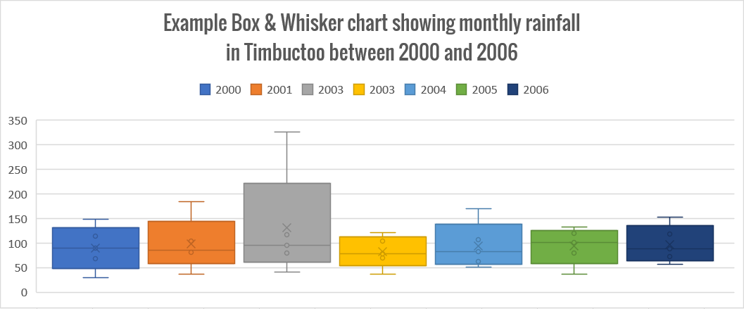
Notice that the 2003 data appears to show an extremely high rainfall measurement compared to every other year.
Box and Whisker charts, as they are know in Excel, were not always available. In older versions of Excel, the only way to create this kind of chart was to create a stacked column chart then modify its various components using tools like errors bars.
But now, it's much easier.
In this post, you'll see how to set up your data for a box plot, then how to create the chart and finally the modifications that will enhance the final product.
1. How to set up data for a box and whisker plot
Consider the following data showing the monthly rainfall in Timbuctoo between 2000 and 2017.
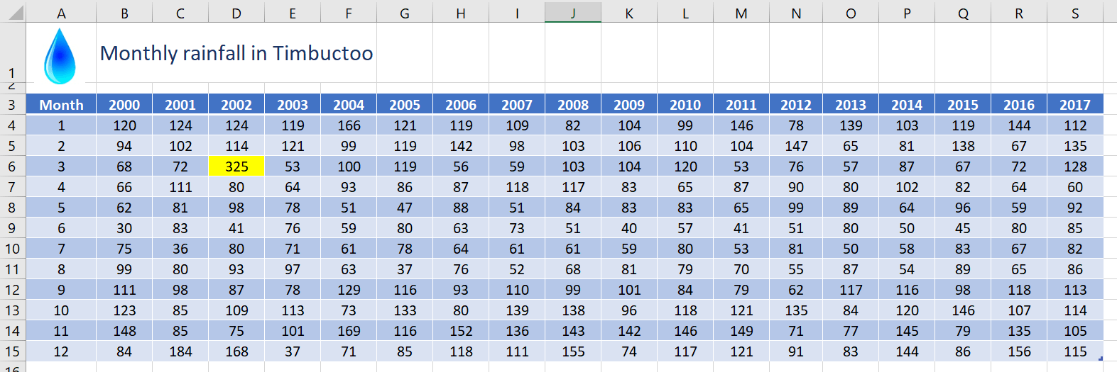
An outlier/anomaly has been highlighted yellow (cell D6).
For the example you are about to see, only a subset of the data is used (the data between 2000 and 2006).
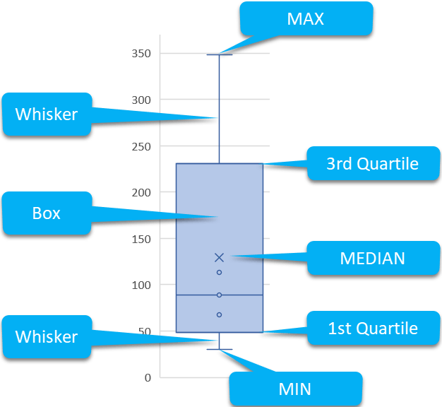
Box & Whisker charts do not directly use the source data. Instead, 5 new values are calculated and used.
A) Breakdown of a box plot
B) Formulas used to create the data
Here are the formulas required to calculate the 5 new values used in the box plot.
MIN
QUARTILE 1
MEDIAN
QUARTILE 3
MAX
c) What the final data looks like
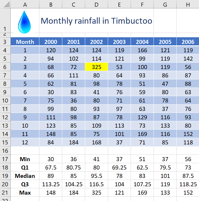
After creating these formulas, here is the data that is used to create the Box & Whisker chart. This example is only using the data for years 2000 to 2006.
2. The workaround to create the Box Plot (Box and Whisker) the way it 'should' look
The Box and Whisker chart type in Excel is still quite buggy. It’s still a reasonably new chart type and there are a few wrinkles to iron out.
Hence the weird workaround you’re about to see.
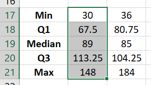
1. Select the MIN, Q1, MEDIAN, Q3 and Max cell range (B17:B21) for one column only.
DO NOT SELECT ANY HEADINGS. If you do you will end up with a chart full of ‘x’s rather than the boxes and whiskers.
Also, where the heading data is normally displayed on the horizontal chart axis, it is not displayed anywhere on a box and whisker chart. You simply see ‘1’ and it’s easiest just to switch it off or delete it, once the chart is created.
2. Click the Insert tab | Recommended
Charts | All
Charts | Box & Whisker.
This is what the initial chart looks like:
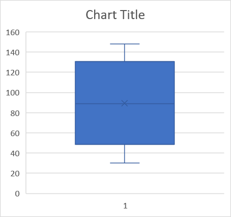
3. The 2 steps so far were just to create the chart in the right orientation. Now, we select the real data we want to use on the chart.
With the chart selected, click the Select Data icon on the Chart Design ribbon.
4. Select the full range of data.
Once again, DO NOT INCLUDE HEADINGS.
5. Click OK. The chart will adapt to reflect the new data range.
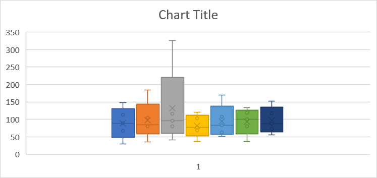
We’ll revisit this chart to make some changes in a moment, but before we do, let’s look at what happens if you don’t follow this workaround.
3. WHAT HAPPENS IF YOU DON’T USE THE WORKAROUND?
Sticking with a 7-year range, if you select the full range of data straight off the bat, this is what happens:
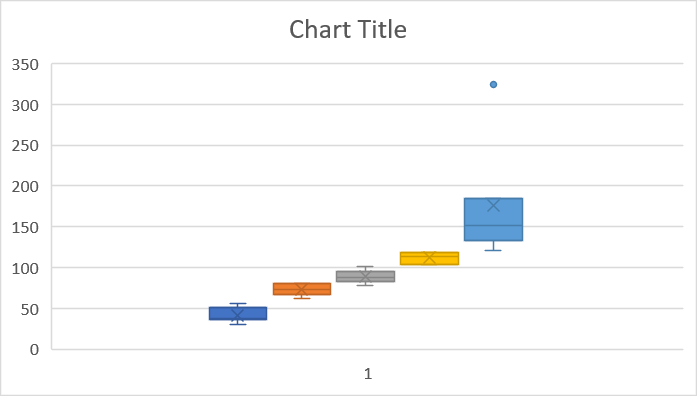
Where there should be 7 boxes there are only 5 because the data has been plotted transversely (columns vs rows). Even if you use the Switch Row/Column icon on the Chart Design ribbon, the problem does not resolve.
Despite much research I have not been able to find a solid reason why this happens. If you discover (or know) the reason, let me know in the comments below! I will be very grateful and you can have your moment in the spotlight!
Until then, use the workaround.
4. How to spread out the box plot elements
When the box plot is first created, all the elements are bunched up.
To spread out the chart elements:
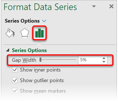
1. Double-click any element to display the Series Options in the sidebar.
2. In the sidebar, click the Series Options drop-down arrow and select any series. When you make a change to one series it makes the same change to every series.
3. Click the 3rd icon (also called Series Options)!
4. Adjust the Gap Width percentage. The lower the number (e.g. 5%) the more spread out the chart elements become.
5. How to change the scale on the axis
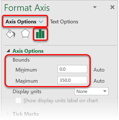
1. In the sidebar, click the options drop-down arrow and choose Vertical Value Axis.
2. Click the 3rd icon.
3. Under the Axis Options heading, under the Bounds subheading, set the Minimum and Maximum value you want to use on the axis.
6. How to switch on the legend (to give some meaning to the chart colours)
1. On the Chart Design ribbon, click Add Chart Element then hover over the Legend option and choose where to position it.
It is better to use the legend rather than data labels on a Box & Whisker chart because there are 5 values per element.
7. What next?
I hope you found plenty of value in this post. I'd love to hear your biggest takeaway in the comments below together with any questions you may have.
Have a fantastic day.


About the author
Jason Morrell
Jason Morrell is a professional trainer, consultant and course creator who lives on the glorious Gold Coast in Queensland, Australia.
He helps people of all levels unleash and leverage the power contained within Microsoft Office by delivering training, troubleshooting services and taking on client projects. He loves to simplify tricky concepts and provide helpful, proven, actionable advice that can be implemented for quick results.
Purely for amusement he sometimes talks about himself in the third person.
SHARE


