You too can use these incredible chart tools and chart options to transform any one of the 17 standard chart types into the best chart possible.
While some chart tools are unique to a particular chart type, many are common. This post explores those.
1. How to create a chart with one key press
If you're not sure what type of chart would be best, you can let Excel decide. Most often it gives you a column chart but it depends on your data. And it's done with just one keypress.
It’s easier than you think.
1. First make sure your data is ready.
2. Click somewhere in your data. Excel will work out the boundaries (where the data ends) for you.
3. Press F11. This creates a chart from the selected data and places it on a new worksheet.
2. How to create a chart using the ribbon
HEADS UP! Microsoft often add new icons, rename ribbons or move icons to a different position.
1. Make sure your data is ready.
2. Click somewhere in your data. Excel will work out the boundaries for you. If you want to define your own boundaries, e.g. just a portion of a table) select the range with your mouse.
3. Click the Insert tab.
4. Choose a chart type and if offered, a sub-type.
5. For example, if you click the Column Chart icon, 13 sub types are offered including 2-D, 3-D, stacked and clustered.
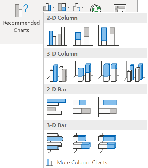
6. If you click Recommended Charts the Insert Chart dialog is displayed.
- The Recommended Charts shows you what chart types, layouts and configurations Excel thinks is best for your data. This is an easy option if you are just starting out.
- The All Charts tab lists 17 different major types of chart in the left sidebar. Whichever one you select the sub-types and variations are listed on the main window.

3. Where to find the chart tools
Whichever type of chart you decide to go with you will receive a set of tools to allow you to configure and design your chart however you want.
At the top of the screen are the Design and Format tabs which sit under under the title banner called Chart Tools.

These chart tools are all contextual. If your chart is not selected, you will not see these ribbons.
The Design ribbon is the one you will use the most.
The Format ribbon has tools to add another layer to the chart such as arrows pointing to important elements.
On the upper edge of the chart itself are the Chart Icon Controls which provide a quick way to make changes to your chart.
To be fair, the charts that Microsoft give you out of the gate are pretty darn good, so you don’t need to waste half a day fiddling and tweaking – unless that’s your thing!
4. Chart Type
As with any such question, the answer is: It depends.
There are many chart types. Each chart represents the data in a particular way, and you may find that a different chart type depicts the data better. For example, you could change a column chart to a line chart to see the trend more clearly. The table below show the best type of chart to use for different data.
Chart type | When to use? |
Column or Bar chart | Ideal for comparison of one item against another. |
Line or Area chart | Ideal for showing a trend. |
Pie chart | Pie charts can only be used on a single series of data, i.e. one row of data or one column of data. Each data value is a proportion of the total. |
Donut / Radar / Stock / Surface / Tree map / Box & Whisker / Scatter charts | You won’t need these as a beginner. When the volume of data is large and the requirements more complex, these charts come out and party. |
To switch to a different chart type:
1. Click the chart to select it, then click the Design tab under Chart Tools.
2. Click the Chart Type icon (on the right side of the ribbon).

3. Choose a different chart type from the gallery.
5. Chart Style
In the past you had to invest some serious time to construct a good-looking chart. Those days are gone. Microsoft provide a large selection of pre-done chart designs. You just need to pick one. The styles include different variations of colours, configurations and components.
Even if you can’t find a style that’s perfect you can normally find something that’s pretty close to what you need and make a couple of final tweaks yourself.
1. Click the chart to select it, then click the Design tab under the Chart Tools banner.
2. Click the MORE button in the bottom-right corner of the Chart Styles gallery.
3. Hover over a style thumbnail to preview how your chart will look if you select that style.
4. Click a style thumbnail to apply it to your chart.

You can also select from the same style gallery (albeit in a vertical arrangement) by clicking the paintbrush icon in the Chart Icon Controls at the top-right edge of the chart.
6. Colour Scheme
The default colours are functional, but if you need to incorporate your organisation’s branding colours, or just want to go a little bit funky, here’s what you do:
1. Click the chart to select it.
2. Click the Design tab under the Chart Tools banner.
3. Click the Change Colors icon.
4. Choose a Colorful scheme or a Monochromatic scheme (variations of the same colour). Each colour in the scheme is applied to different chart elements
Alternatively, or in addition,
1. Right-click any chart element.
2. Choose Format x, where x is the element, e.g. Format Data Series.
3. In the right-hand pane, set the Fill colour and / or the Outline colour. Apply an effect if you wish.
![Change the chart’s colour scheme by clicking the Change Colors icon on the Design ribbon under Chart Tools or by right-clicking any chart element and choosing Format [whatever] Change the chart’s colour scheme by clicking the Change Colors icon on the Design ribbon under Chart Tools or by right-clicking any chart element and choosing Format [whatever]](http://officemastery.com/wp-content/uploads/2020/03/E1-08-07-changing-the-charts-coulur-scheme.png)
7. Quick Layouts
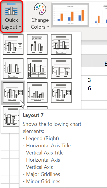
The Quick Layouts provide an easy way to configure the elements on your chart, such as the positioning of the legend, the combination of gridlines and more.
The options are different for each chart type.
1. Click the chart to select it.
2. Click the Design tab under the Chart Tools banner.
3. Click the Quick Layout icon.
4. Choose a layout from the gallery.
If you hover over a thumbnail you will see a summary of the layout attributes.
8. Switching Chart Series
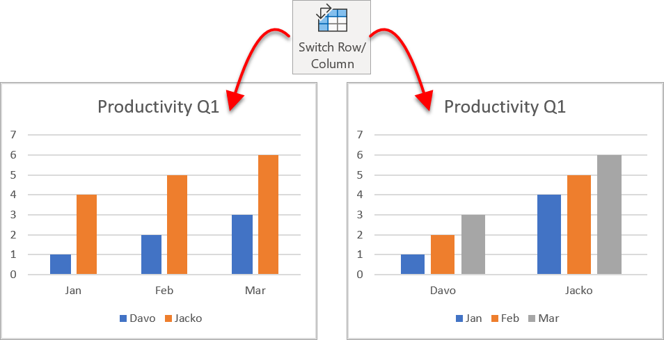
When you create a column chart it places the column headings from the source table as labels on the horizontal axis and the row labels from the source table as legend items.
You can quickly switch these over to plot the chart the other way.
1. Click the chart to select it.
2. Click the Design tab under Chart Tools.
3. Click the Switch Row/Column icon.
9. Move Chart
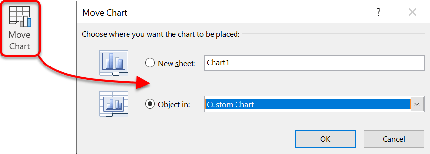
There are 2 places where a chart can reside:
- As an object on a slide. This option enables the chart to be resized an repositioned wherever you want.
- On its own worksheet. This is a full-sized chart that fills the worksheet area on the screen.
To choose where to place the chart:
1. Click the chart to select it.
2. Click the Design tab under Chart Tools.
3. Click the Move Chart icon.
4. In the Move Chart dialog, either,
- Choose New Sheet and type the new sheet name.
- Choose Object In then from the drop-down list select which worksheet to put the chart.
10. Change Source Data
Often the source data used by the chart is added to, changed or has parts removed. especially if the data is time sensitive. For example, you may add the latest month’s data to the source data each month then change the chart settings to pick up the new data.
If your data is in a formatted Excel table, you won't have to use this option unless you need to pick up a new data source.
Here's the process:
1. Click the chart to select it.
2. Click the Design tab under the Chart Tools.
3. Click the Select Data icon.
The original data is boxed by marching ants and the Select Data Source dialog is displayed.
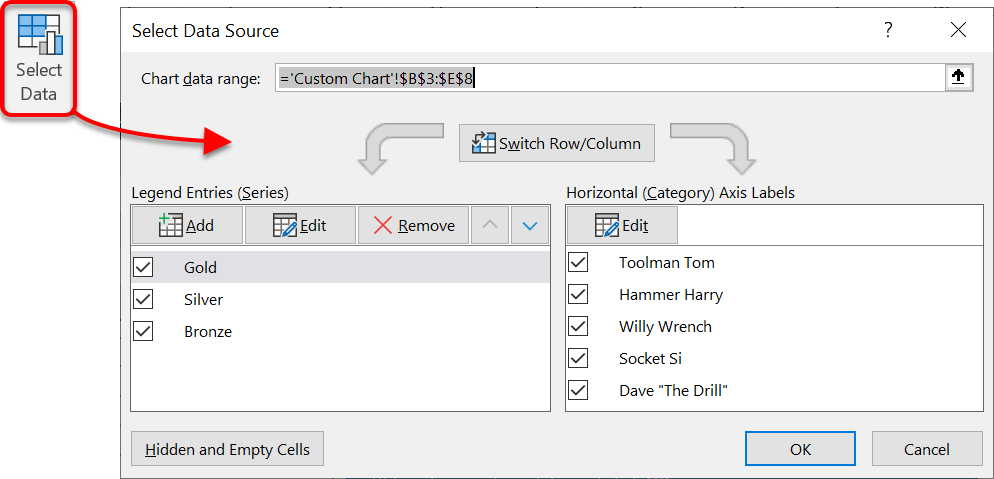
To add a new series:
1. Click the Add button. A small Edit Series dialog is displayed
2. In the Series name box, type a label or select a column heading cell from the source data
3. In the Series values box, select the cell range that contains the new data to be added.
4. Click OK.

To edit an existing series:
1. Click the Edit button. A small Edit Series dialog is displayed.
2. You can manually change the cell ranges but be VERY CAREFUL if you choose this approach as it is very easy to insert rogue cell references by mistake.
3. It is safer to wipe out the existing entry and reselect the cell range directly from the worksheet.
4. Click OK.
To remove a series:
1. Select the series to delete.
2. Click the Remove button.
3. There is no “Are you sure” message, so be careful.
To re-order the series:
1. Select a series.
2. Click the up arrow or down arrow buttons.
3. Click OK when done.
11. Empty data cells
By default, hidden data or data that is grouped and collapsed is not plotted on a chart. Also, empty cells or cells that contain zero ARE plotted on the chart which can throw out line charts and trend lines.
To override these default settings:
1. Click the chart to select it.
2. Click the Design tab under Chart Tools.
3. Click the Select Data icon.
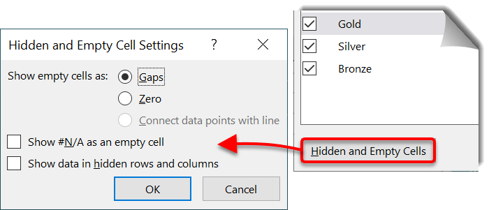
4. In the Select Data Source dialog , click the Hidden and Empty Cells button.
5. In the Hidden and Empty Cell Settings dialog,
6. Choose to show empty cells as gaps or zeroes.
7. Choose how to handle errors in the source data.
8. Tick Show data in hidden rows and columns to plot chart data regardless of whether or not columns and rows are hidden or collapsed.
12. Filter your chart data
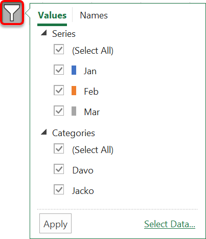
If your chart is too cluttered due to the sheer amount of data, then you can hide or show data items on demand.
1. Select the chart then click the Filter icon in the Chart Icon Controls at the top-right edge of the chart Every series and category item are listed with a tick box.
2. Tick the items you want to show and untick those you want to hide.
3. Click Apply
12. Chart Title
To change the title text:
1. Double-click the chart title to highlight the text.
2. Overtype the default text with your own chart title.
To re-position the title:
1. Select the chart then click the Design tab under Chart Tools.
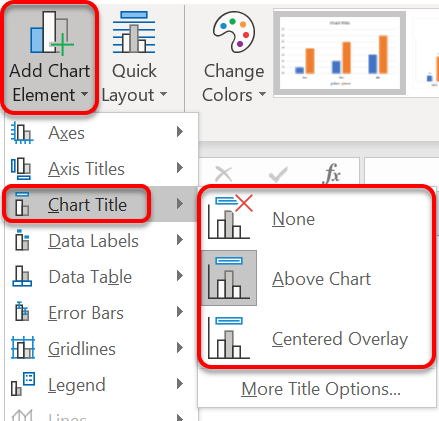
2. Click Add Chart Element (far-left icon) or click the PLUS icon in the Chart Icon Controls on the top-right edge of the chart.
3. Choose Chart Title.
4. Choose whether to position the overlay the title, place it above the chart or switch it off entirely.
Alternatively, click the frame around the title then drag the title to the new position.
13. Chart Axes
The horizontal axis normally displays the column headings or row labels from the original data, so it doesn’t require a description.
However, the vertical axis often contains numbers and it’s useful to add a context for those numbers. For example, do the numbers represent quantity, height or distance?
To display a description (label) for the vertical axis:
1. Select the chart then click the Design tab under Chart Tools.
2. Click Add Chart Element (far-left icon) or click PLUS icon at the top-right edge of the chart.
3. Click Axis Titles.
- Click Primary Vertical to label the vertical axis.
- Click Primary Horizontal to label the bottom axis.
- Click Secondary Vertical to label the secondary axis (when using Combo charts).
- Click Depth to label the depth axis on 3D charts.

To re-label the axes:
1. Double-click the axes label on the chart to place the cursor inside.
2. Overtype the existing axes description with your own.
3. To change the physical characteristics of the axis title label (colour, thickness etc.), click More Options to open up the chart side bar, then set the options as required.
14. Gridlines
The gridlines are the horizontal lines that sit behind the chart columns. They help you to compare two columns that may be on different sides of the chart but have similar heights. The gridlines provide a consistent reference point.
The Horizontal Major Gridlines are the most common.
You can also switch on the Minor horizontal gridlines, the Major vertical gridlines or the Minor vertical gridlines, depending on how much detail you want to see.
1. Select the chart then click the Design tab under Chart Tools.
2. Click Add Chart Element (far-left icon) or click the PLUS icon at the top-right edge of the chart.
3. Click the arrow next to Gridlines.
4. Tick the gridline combination you want to see.
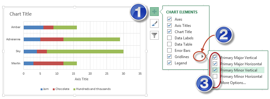
To change the physical characteristics of the gridlines (colour, thickness etc.), click More Options to open up the chart side bar, then set the options as required.
15. Legend
The legend is the colour key displayed next to the chart that indicates what each coloured column represents. The legend may be switched off or re-positioned.
To switch the legend on or off:
1. Select the chart then click the Design ribbon under Chart Tools.
2. Click Add Chart Element (far-left icon) or click the PLUS icon at the top-right edge of the chart.
3. Tick or un-tick the Legend tick box.
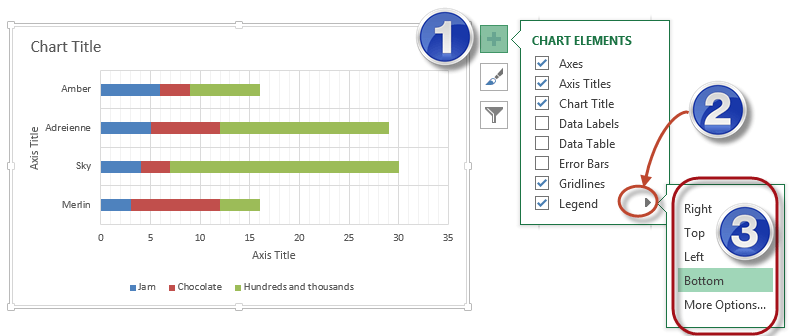
To reposition the legend:
1. Select the chart then click the Design ribbon under Chart Tools.
2. Click Add Chart Element (far-left icon) or click XXX on the top-right edge of the chart.
3. Click the arrow next to Legend.
4. Choose Top, Bottom, Left or Right.
16. Data Labels
Data Labels place the data value with the column itself. This is a great tool for differentiating columns that are very close in value, for example 95.5 and 95.6. The labels may be placed outside or inside the chart elements or switched off.
1. Select the chart then click the Design ribbon under Chart Tools.
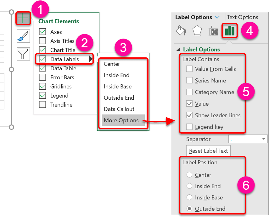
2. Click Add Chart Element (far-left icon) or click the PLUS icon at the top-right edge of the chart.
3. Click the arrow next to Data Labels.
4. Choose where to position the data labels. These options will differ depending on the type of chart you are working with.
For an easier way to customise your data labels,
1. Click More Options …
2. In the side panel, ensure the Label options icon is selected (looks like a column chart).
3. Choose which elements to display (e.g. category name, value) and where to position the labels (e.g. outside end).
4. The Leader Lines are useful because if you move a data label, it stays connected with the correct chart element so you can’t get mixed up.
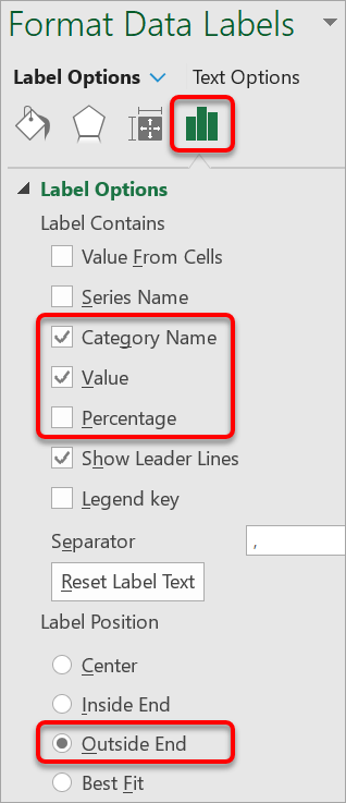
When you are working with pie charts, the most effective way to use data labels is to include the category name alongside the value and/or the percentage.
To play with these options …
1. Select the chart then click the Design ribbon under Chart Tools.
2. Click Add Chart Element (far-left icon) or click on the top-right edge of the chart.
3. Click the arrow next to Data Labels.
4. Click More Options to display the charts side bar.
5. In the side panel, ensure the Label Options icon is selected (looks like a column chart)
6. Tick the Category Name.
7. Tick Value or Percentage, or both.
8. Further down, click Outside End.
This is personal preference but for pie charts this option often works the best.

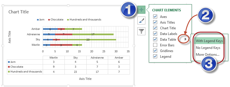
17. Data Table
Data Tables are an alternative to Data Labels. While you could use them both together, they perform the same function so it’s normally one or the other.
A Data Table shows all the chart data in tabular format underneath the main chart.
In a presentation or a report, this satisfies the analytical people who like to study data as well as clearly conveying the message to those that don’t need to see the data specifics.
1. Select the chart then click the Design tab under Chart Tools.
2. Click Add Chart Element (far-left icon) or click the PLUS icon at the top-right edge of the chart.
3. Click the arrow next to Data Table.
4. Choose whether to display the data table with legend keys or without.
18. Formatting any chart component
A chart is made up of many different components, such as bars or columns, axes, title, legend, plot area etc. Each of these can be selected and formatted independently to make it look better.
To select a chart component, choose one of the following methods:
- Single-click a chart component then use the options on the Format tab under Chart Tools.
- Single-click the chart component, then press Ctrl 1 to display the Format side bar.
- Right-click the chart component and choose Format x, where x is the chart component, e.g. Format Legend.
Once the Format sidebar is displayed:
- Click the Paint bucket icon to set the fill and outline attributes.
- Click the Pentagon icon to apply effects such as shadow, reflection or bevel.
- Click the Label Options icon (looks like a column chart) to format the content, e.g. labels, number format.
There are far too many combinations to include in this post, but a few are discussed in the following sections.
19. How to smooth out a line on a line chart
Line charts simply connect each data point on a chart with a straight line. This creates a jagged line which is hard on the eye. To address this:
1. Carefully, right-click on the line you wish to smooth out then choose Format Data Series.
2. Click the Paint Bucket icon in the sidebar
3. At the bottom of the options, choose Smoothed Line.
Unfortunately, you cannot smooth out more than one line at a time but with the sidebar open at the correct spot, you can left-click each line in turn then click Smoothed Line in the sidebar.
20. Gradient Effect
A gradient is where one colour morphs into another. You can choose these colours yourself or choose from a variety of pre-set designs.
For a gradient you can set up to 10 stops each with its own colour, or you could keep it simple and have just one stop at each end.
You can also specify the direction, nature and transparency of the fade. Adding gradients to shapes is an easy way to make your charts look professional.
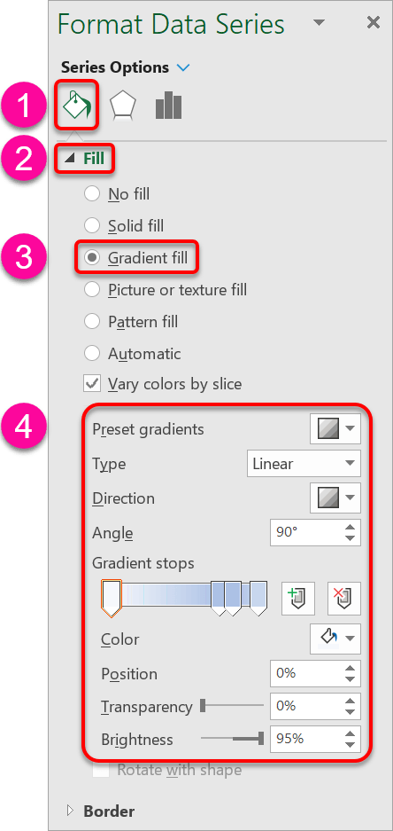
1. Right-click a 2-dimensional chart component (i.e. not a line) then choose Format x, where x might be Data Series, Data Point or Plot Area etc.
2. In the sidebar, click the icon.
3. Open the Fill group.
4. Select Gradient Fill.
5. Check out the pre-set gradients for a quick option.
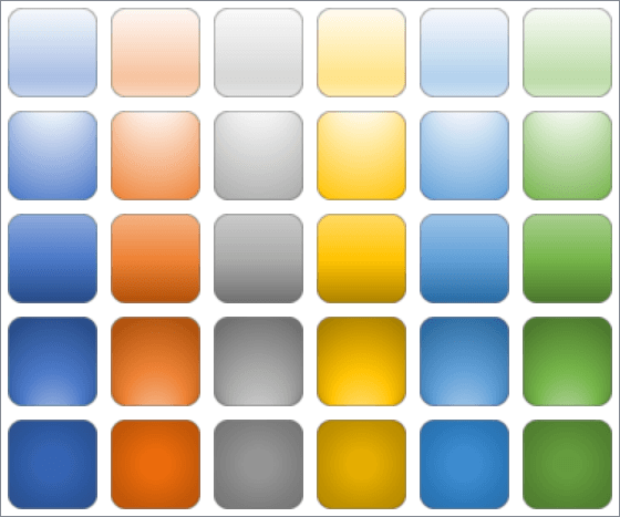
To set your own gradient colours:
1. To remove a stop marker, click it to select it, then click the icon with the red cross to remove it.
2. To add a new stop marker, click anywhere on the gradient bar or click the icon with the green plus sign.
3. Drag the stop markers left or right to reposition them and redistribute the colours.
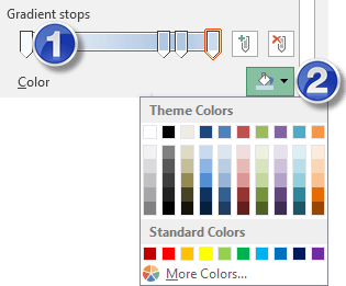
To set a stop colour:
1. Select a stop marker.
2. Click the Color drop-drown arrow to display the colour palette.
3. Select a colour.
4. Rinse and repeat for the other markers.
To set a direction and angle for the gradient:
1. Choose an option from the Direction drop-down gallery.
2. Set a percentage for the Angle setting.
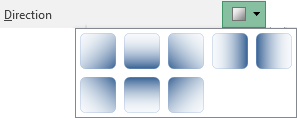
To set the Transparency and Brightness adjust the sliders (or type in a percentage).

To set the gradient type, click the drop-down arrow next to Type and choose from Linear, Radial, Rectangular and Path.
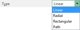
Different options work better for different chart element shapes.
21. Textured Effect
Textures are almost as old as Microsoft!
1. Right-click a 2-dimensional chart component (i.e. not a line) then choose Format x, where x might be Data Series, Data Point or Plot Area etc.
2. In the sidebar, click the Paint Bucket icon.
3. Open the Fill group.
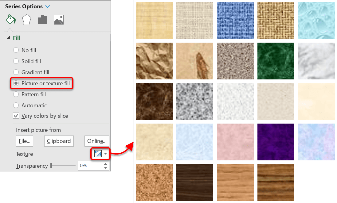
4. Select Picture or Texture fill.
5. Click the Texture drop-down arrow.
6. Choose a texture from the gallery.
22. Image Fill
If you have a suitable image, you can use it as the fill for a 2D component.
1. Right-click a 2-dimensional chart component (i.e. not a line) then choose Format x, where x might be Data Series, Data Point or Plot Area etc.
2. In the sidebar, click the Paint Bucket icon.
3. Open the Fill group.
4. Select Picture or Texture fill.
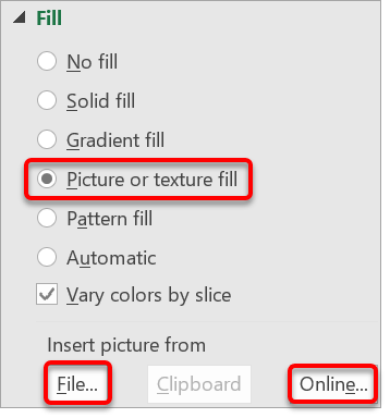
- Click the File button to use a picture stored on file.
- Click the Online button to conduct an online search for a suitable image.
23. Rotation and Perspective
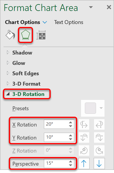
A 3D chart can be manipulated in such a way that you can view it from any angle.
1. Right-click on the chart area of a 3D chart.
2. In the sidebar, click the Pentagon icon.
3. Open the 3-D Rotation group.
4. Play with the X Rotation, Y Rotation, Z Rotation (if available) and Perspective settings.
24. Custom chart types
If you want to reuse your custom chart settings on another chart, you can create a chart template:
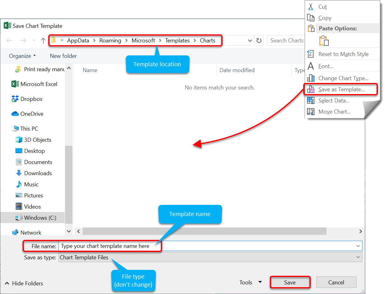
To save a chart template:
1. Right-click the chart and choose Save As Template.
2. Don’t change the location. Microsoft uses a dedicated templates folder.
3. Type a name for the chart template.
4. Click Save
To use a saved chart template:
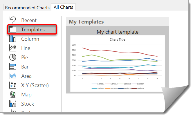
1. Select the chart that you wish to apply the template settings to.
2. Click the Design tab under Chart Tools.
3. Click the Change Chart Type icon.
4. On the All Charts tab, click Templates.
5. Choose your custom template from the gallery then click Ok.
25. Summary
- Select your data and press F11 to create an instant chart. Alternatively, select the Insert tab type and choose a chart from Chart Types group.
- When the chart chart is selected you will see the Chart Tools banner which has two tabs/ribbons called Design and Format.
- The Design ribbon controls how things look and is where you change the Chart Type, apply a chart style or layout, switch the rows/columns, set the data source and specify whether the chart sits on a worksheet or has its own dedicated worksheet
- The Format ribbon adds another layer of graphic elements like arrows, shapes and WordArt.
- There are 17 major chart types and numerous sub-types (side by side bars vs. stacked bars etc.). Column charts are best for a few distinct values (say, up to 20). Line charts are best for showing a trend and can handle larger volumes of data. Pie charts are visually powerful but only work with one series of data. For best results switch on the data labels.
- There is a direct relationship between the source data and the chart. A change to one will reflect on the other. To use a different range of source data, click the Select Data icon on the Design ribbon, select the new range(s) you wish to use and click OK.
- To switch the labels on the x axis with those on the legend, click Switch Row/Column.
- To place the chart on its own worksheet, click the Move Chart icon on the Design ribbon, choose New Sheet, type a name for the sheet and click OK.
- To place the chart as a floating object on an existing sheet, click the Move Chart icon on the Design ribbon, choose Object In, select a sheet from the list and click OK.
- To format any chart component, use the chart formatting side pane.
- To switch chart elements on or off, click the + icon, situated next to the chart in the top-right position, then tick or un-tick each chart element. While here, to change the settings for the chart element, click the arrow next to the element name and set the options as appropriate.
- There are 4 fill effects to choose from – Gradient, Texture, Pattern and Picture.
- 3D charts can be rotated using the 3D Rotation options (click Effects in the side pane).
- To save a new custom chart type, right-click on the chart and choose Save As Template, type a name for the file and click OK. To use a previously saved chart type, click the Change Chart Type icon on the Design ribbon, click the Templates option, locate your template and click OK.
I hope you found plenty of value in this post. I'd love to hear your biggest takeaway in the comments below together with any questions you may have.
Have a fantastic day.


About the author
Jason Morrell
Jason Morrell is a professional trainer, consultant and course creator who lives on the glorious Gold Coast in Queensland, Australia.
He helps people of all levels unleash and leverage the power contained within Microsoft Office by delivering training, troubleshooting services and taking on client projects. He loves to simplify tricky concepts and provide helpful, proven, actionable advice that can be implemented for quick results.
Purely for amusement he sometimes talks about himself in the third person.
SHARE


