What is a Combo Chart?
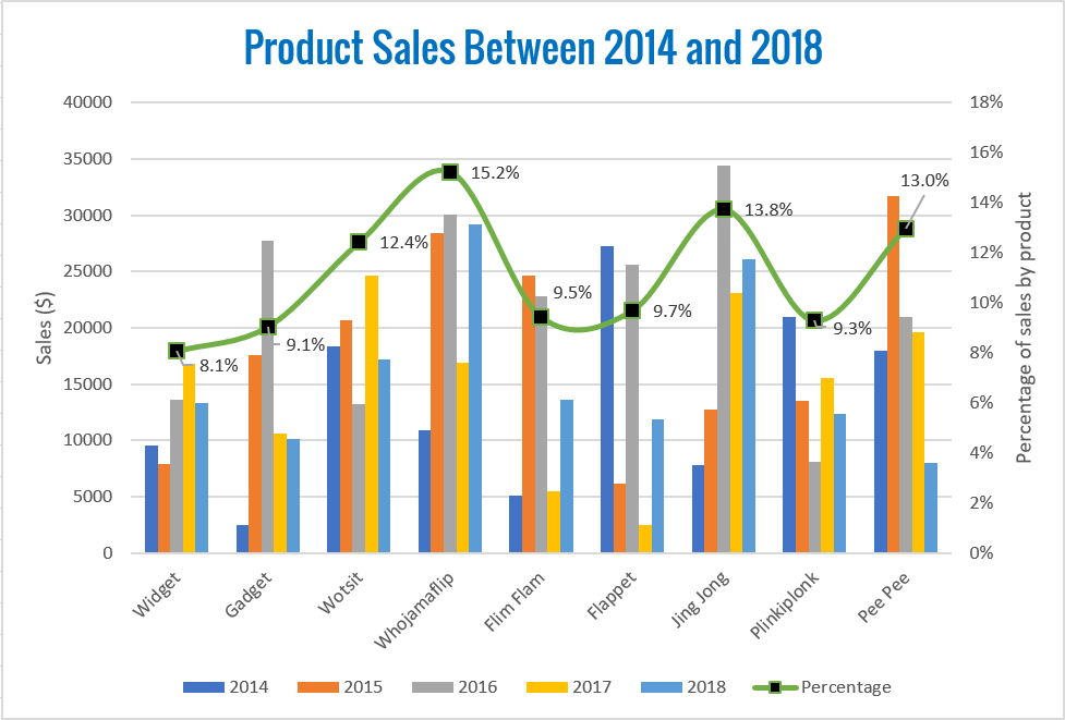
Combo charts allow you to combine a column chart with a line chart and use two vertical axes simultaneously.
They are incredibly useful when you need to plot two sets of data that work within completely different ranges. For example, 1 to 100 for one series and 10,000 to 100,000 for the second series.
Consider this sales data:
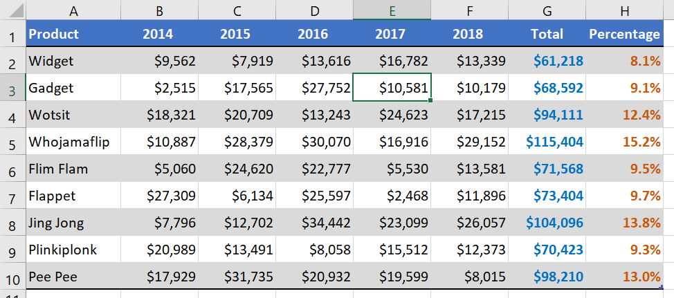
If dollar figures and percentage figures were to be plotted on the same chart, the percentages would be unusable because they would flatline against the bottom axis.
This is because their decimal equivalents are so low. For example, 8.1% is equal to 0.081.
How to create a Combo Chart
To create a combo chart using two series:
1. Select just the portions of the data you want to chart. In the example above, we would not want to plot the TOTAL data, so only A1:F10 and H1:H10 are selected.
2. Select the Insert tab.
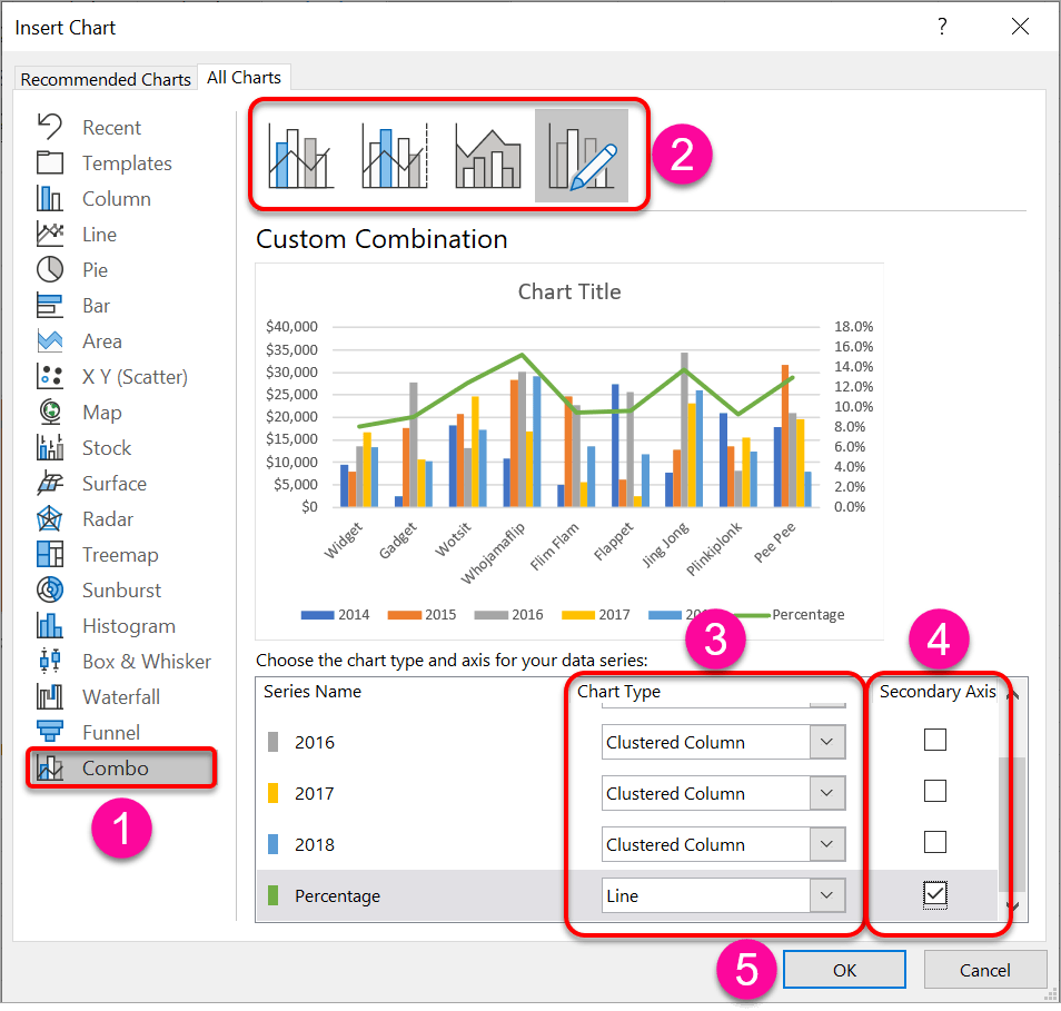
3. Go the Recommended Charts icon, select the All Charts tab, then choose Combo.
4. Select a Combo variation at the top of the dialog.
5. At the bottom of the dialog, for each series, assign a chart type.
In the example above, the 2014, 2015, 2016, 2017 and 2018 series are all assigned a Clustered Column chart type, while the Percentage series is assigned a Line chart type.
6. In the bottom-right of the dialog, tick the Secondary Axis box for the Percentage series. This will add a second vertical axis on the right side of the chart for the sole use of the Percentage series.
(You could also start with a standard Clustered Column chart then choose Change Chart Type on the ribbon and switch it to Combo. From there, select one of the data series shown at the bottom and switch it to Line and if necessary, tick Secondary Axis).
How to change the scale of one of the axes
To change the scale of an axis:
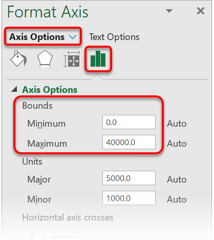
1. Double-click an axis label to display the sidebar.
2. In the sidebar click the icon.
3. Under the Axis Options heading, set the Minimum and Maximum values under Bounds.
How to smooth out the lines
To smooth the line:
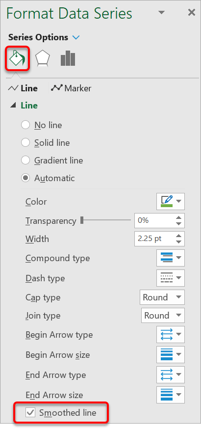
1. Double-click on the line to display the sidebar.
2. In the sidebar select the Paint Bucket icon.
3. Tick the Smoothed Line box at the bottom of the list.
How to add, reconfigure or reposition data labels
To add or reconfigure data labels:
1. Select a series.
2. Click the PLUS icon on the top-right edge of the chart.
3. Click Data Labels.
4. Select a position (centre, left, right etc.)
SUMMARY
Combo charts are very useful as they allow you to consolidate and overlay two different data series on the same chart, each with an independent axis. I encourage you to try it out.
I hope you found plenty of value in this post. I'd love to hear your biggest takeaway in the comments below together with any questions you may have.
Have a fantastic day.


About the author
Jason Morrell
Jason Morrell is a professional trainer, consultant and course creator who lives on the glorious Gold Coast in Queensland, Australia.
He helps people of all levels unleash and leverage the power contained within Microsoft Office by delivering training, troubleshooting services and taking on client projects. He loves to simplify tricky concepts and provide helpful, proven, actionable advice that can be implemented for quick results.
Purely for amusement he sometimes talks about himself in the third person.
SHARE

