Stock charts allow you to plot the price of a stock over time, such as daily, weekly, monthly, quarterly, 6-monthly, yearly or longer such as 5 years or 10 years.
On each stock chart in Excel, the variance in stock price is shown using candlesticks.
There are four types of stock chart in Excel, each of which are explained in this post:
- The High-Low-Close Stock Chart
- The Open-High-Low-Close Stock Chart
- The Volume-High-Low-Close Stock Chart
- The Volume-Open-High-Low-Close Stock Chart
1. High-Low-Close Stock Chart
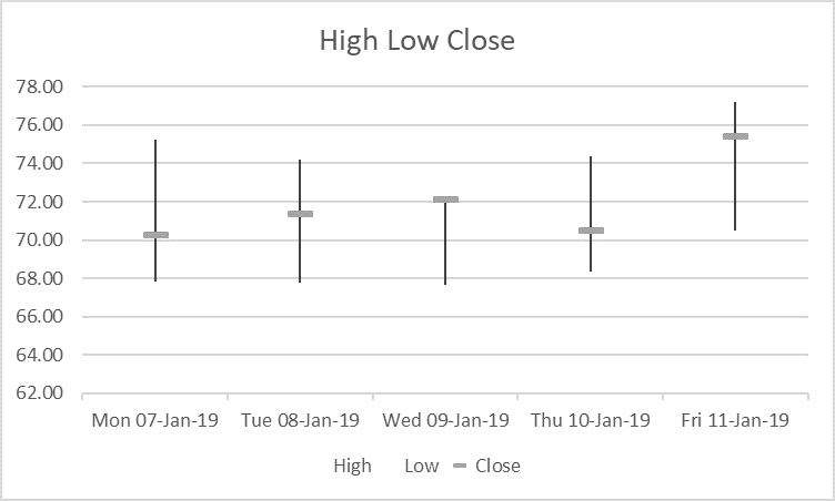
The High-Low-Close stock chart plots the highest, lowest and closing price over time.
- The top of the candlestick shows the highest price reached during the day (or whatevr time period you are plotting).
- The bottom of the candlestick shows the lowest price reached during the time period.
- The horizontal marker indicates the closing price.
2. Open-High-Low-Close Stock Chart
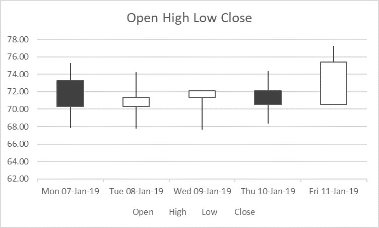
The Open-High-Low-Close stock chart plots the highest and lowest price as well as the opening and closing price.
- The candlestick shows the highest and lowest price.
- A black block means that the stock price fell. These are called Down Bars.
- A white block means that the stock price rose. These are called Up Bars.
3. Volume-High-Low-Close Stock Chart
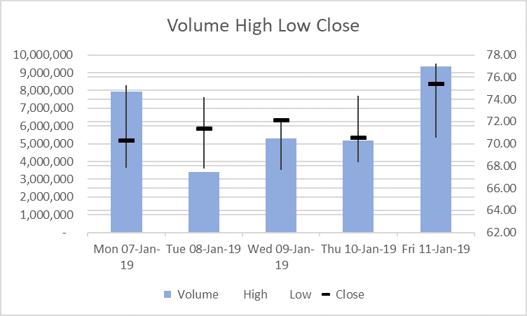
The Volume-High-Low-Close stock chart plots the highest, lowest, opening and closing price and the volume of shares traded over time.
- The candlestick shows the highest and lowest price.
- The black marker indicates the closing price.
- The shaded column shows the volume traded.
- The left vertical axis shows the trading volume.
- The right vertical axis shows the stock price.
4. Volume-Open-High-Low-Close Stock Chart
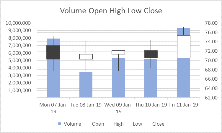
The Volume-Open-High-Low-Close stock chart plots the highest, lowest, opening and closing price and the volume of shares traded.
- The candlestick shows the highest and lowest price.
- The black marker indicates the closing price.
- The black and white block markers show the opening and closing price.
A black block means that the stock price fell. These are called Down Bars.
A white block means that the stock price rose. These are called Up Bars. - The shaded column shows the trading volume.
- The left vertical axis shows the trading volume.
- The right vertical axis shows the stock price.
5. Example data
Consider this data.
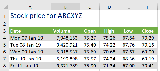
- The first column may contain dates or stock names.
- The Volume is the number of trades made (bought or sold).
- The open, high, low and close figures are for the stock price.
6. How to create a stock chart in Excel
To create a stock chart in Excel:
1. Select the specific data ranges you need from your data, including the headings.
In the example data above:
- For a High-Low-Close stock chart,
select the ranges A3:A8 and D3:F8. - For an Open-High-Low-Close stock chart,
select the ranges A3:A8 and C3:F8. - For a Volume High-Low-Close stock chart,
select the ranges A3:B8 and D3:F8 - For a Volume-Open-High-Low-Close stock chart,
select the range A3:F8:
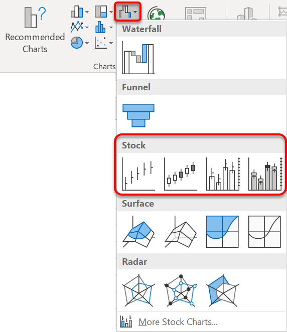
2. Click the Insert tab then the Waterfall, Funnel, Stock, Surface or Radar chart icon in the Charts group, or …
Click the Recommended Charts icon | All Charts tab | Stock
3. Select the type of stock chart you wish to use.
7. Changing the stock chart style
It is always worth checking out the Chart Styles on the Chart Tools Design ribbon for different configurations.

8. Reduce the data clutter
To change the amount of data shown on the stock chart, either:
1. Click the Filter icon in the chart icon controls on the top-right edge of the chart and untick items you wish to exclude, or ...
2. Click the Select Data icon on the Design tab under Chart Tools and select a new range of data that you wish to work with.
9. Customise the candlesticks
To customise the candlesticks:
1. Right-click on any candlestick and choose Format High-Low lines to display the side panel.
2. In the side panel, change the candlestick colour (including gradients etc.), thickness, dash type and other characteristics in the side bar.
10. Customise the markers
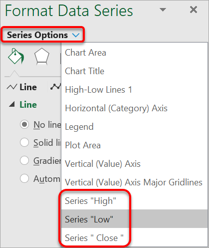
To customise the High, Low, Open or Close markers
1. Right-click on any candlestick and choose Format High-Low lines to display the side panel.
2. In the side panel, click the drop-down arrow on the High-Low Line Options and switch to Series “High”, Series “Low”, Series “Open” or Series “Close”.
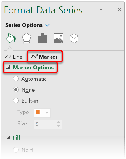
3. Switch to the Marker option.
4. Under Marker Options, change the Built In Type (square, triangle, dash etc) and Size.
5. Under Fill and Border, set the outline and fill colour options.
11. Customise the up bars and down bars
To customise the up bars or down bars
(High-Low-Close or Volume-High-Low-Close charts only)
1. Right-click on any candlestick and choose Format High-Low lines to display the side panel.
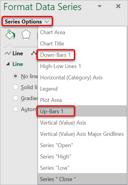
2. In the side panel. click the Options drop-down arrow and switch to Up-Bars 1 or Down-Bars 1.
3. Set the Border and Fill options as appropriate
12. Add a closing price trend line
To show a Closing price trend line:
1. Double-click any closing price marker to display the appropriate settings in the side bar.
2. Under Series Options, choose Fill and Line.
3. Under Line Settings choose anything other than No Line and set the line settings as necessary.
13. Wrap
I hope you found plenty of value in this post. I'd love to hear your biggest takeaway in the comments below together with any questions you may have.
Have a fantastic day.


About the author
Jason Morrell
Jason Morrell is a professional trainer, consultant and course creator who lives on the glorious Gold Coast in Queensland, Australia.
He helps people of all levels unleash and leverage the power contained within Microsoft Office by delivering training, troubleshooting services and taking on client projects. He loves to simplify tricky concepts and provide helpful, proven, actionable advice that can be implemented for quick results.
Purely for amusement he sometimes talks about himself in the third person.
SHARE

