If you've never tried Map Charts, give this a go.
Map charts work with geographical data, which can be country, regional or postcode specific. It then draws the appropriate map for you and divides it up (in pie chart fashion) into different sized segments based on your data and colour-codes each segment.
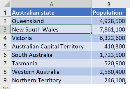
Consider this Australian population data:
How to create a map chart
To create a map chart:
1. Select a single cell in your data to select the entire range or select the specific data range you wish to use.
2. Click the Insert tab then the Maps icon in the Charts group, or …
Click the Recommended Charts icon | All Charts tab | Map
3. Select Filled Map.
- The map is drawn for you.
- Each area is sized and colour-coded on the map. This is also reflected in the legend which displays a single colour gradient bar that includes all the colours on the map
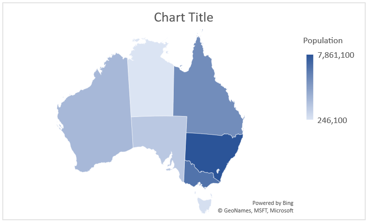
It is always worth checking out the Chart Styles on the Chart Tools Design ribbon for different configurations.

How to change the design layout of a map chart
To change the design layout of the map:
1. Double-click anywhere on the chart to display a sidebar containing all appropriate options for your map.
2. Click the drop-down arrow at the top and choose Series xyz, where xyz is your data (in this example that’s Population).
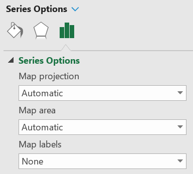
3. Under Series Options you can change the Map Projection, Map Area and Map Labels.
- Map Projection can be set to Automatic, Mercator, Miller and Albers.
- Map Area gives you different region tags: Automatic, Only regions with data, Country/region, Multiple countries/regions and World.
- Map Label can be set to None, Best Fit Only or Show All.
4. Under Series Color you can choose your colours and gradients to be used on your map.
How to change the data label properties
To change the data label properties:
1. Click the PLUS icon in chart icon controls on the top-right edge of the chart (or click Add Chart Element on the left of the Chart Tools Design ribbon)
2. Click the Data Labels option arrow, then choose More Data Label Options.
3. Tick the Category Name and Value boxes.
4. Click the Number option arrow and choose a standard format or set a custom format
With a few tweaks, the map is better than it started, although it still has some obvious flaws such as
- Victoria and Tasmania have incomplete labels and data..
- The Australian Capital Territory (ACT) doesn't even appear.
For international readers the ACT is the territory where the Capital Federal Government is based. There's not much in the ACT besides Canberra, and there's not much in Canberra! As the farmers lamented when Canberra was first built: "Damn waste of a good sheep paddock!"

In the above example, the population figures have been shortened (e.g. 7.9m instead of 7,861,100) by formatting the data labels and using a custom number format [>=1000000] 0.0,,\m;[>=1000] 0,k;0i
Wrap
I hope you found plenty of value in this post. I'd love to hear your biggest takeaway in the comments below together with any questions you may have.
Have a fantastic day.


About the author
Jason Morrell
Jason Morrell is a professional trainer, consultant and course creator who lives on the glorious Gold Coast in Queensland, Australia.
He helps people of all levels unleash and leverage the power contained within Microsoft Office by delivering training, troubleshooting services and taking on client projects. He loves to simplify tricky concepts and provide helpful, proven, actionable advice that can be implemented for quick results.
Purely for amusement he sometimes talks about himself in the third person.
SHARE


