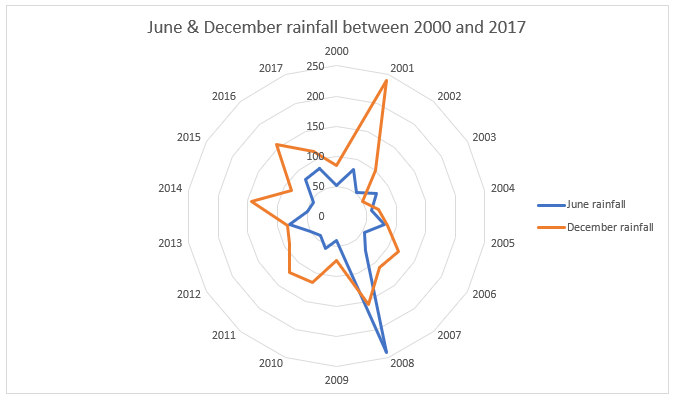
A Radar chart clearly shows any outliers in your data. If the data is within normal range, the shape will be regular. Anomalies will either spike in or spike out.

1. How to set up your data for a radar chart
1. Set up a table with column headings and row labels.
2. The column labels will appear on the outer circumference of the radar chart.
3. The row labels do not appear anywhere on the chart. They are for human reference only.
2. How to create a radar chart
Consider the following data which includes anomalies for June and December, highlighted in yellow:

To create a Radar chart:
1. Select one column or one row of your data that will form the labels on your outer circumference of the Radar Chart. In the example above, the years in cells B3:S3 have been selected.
2. Hold CTRL.
3. Select the numerical data range which will determine the shape(s) of your Radar chart(s). In the example above, the data in B9:S9 and B15:S15 have been selected. In other words, the June row (row 6 ) and the December row (row 12).
4. Click the Insert tab.
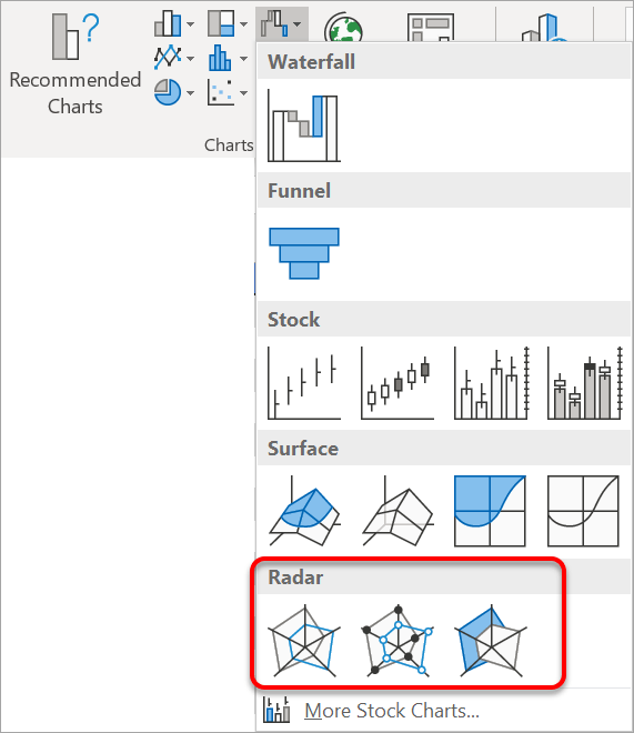
5. Select the Surface or Radar chart icon in the Charts group and select Radar.

6. If your chart shows only a legend and a vertical line, that’s because you are working with rows of data. To fix this, on the Chart Design ribbon, click the Switch Row / Column icon.
If your data falls within a normal range, your shape will be regular.
Anomalies are clearly shown as spikes or dips.
It is always worth checking out the Chart Styles and Quick Layouts on the Chart Tools Design ribbon for different configurations.
3. Show/hide the legend
1. On the Chart Design ribbon, click Add Chart Element then hover over Legend.
2. If you only have a single series of data, untick the Legend to switch it off, and if you have two or more series of data, ensure the Legend is switched on.
4. Add extra data to your Radar chart.
1. On the Chart Design ribbon, click Add Chart Element then click the Select Data icon.
2. Go direct to the data, hold CTRL and select any additional data that you wish to use.
5. Rename the labels.
By default, each data series is called Series 1, Series 2 etc. To make them more meaningful
1. On the Chart Design ribbon, click Add Chart Element then click the Select Data icon.
2. Select a series from the list.
3. Click the Edit button in the dialog.
4. Type a new name
In the example above, each series has been renamed June rainfall and December rainfall.
6. Choose what info to include on data labels
1. On the Chart Design ribbon, click Add Chart Element then choose More Data Label Options.
2. Tick Value or Category.
7. What next?
I hope you found plenty of value in this post. I'd love to hear your biggest takeaway in the comments below together with any questions you may have.
Have a fantastic day.


About the author
Jason Morrell
Jason Morrell is a professional trainer, consultant and course creator who lives on the glorious Gold Coast in Queensland, Australia.
He helps people of all levels unleash and leverage the power contained within Microsoft Office by delivering training, troubleshooting services and taking on client projects. He loves to simplify tricky concepts and provide helpful, proven, actionable advice that can be implemented for quick results.
Purely for amusement he sometimes talks about himself in the third person.
SHARE


