XY Scatter Charts (a.k.a. Scatter Plots) show the spread and disparity of a large dataset and provide a clearer view of the trend(s) and any anomalies that may exist.
In this post, I'll show you how to set up an XY Scatter Chart and how to custonmise it to your requirements.
1. How to create an X Y Scatter Chart
Consider this data. It shows 18 years of monthly rainfall data in Timbuctoo.
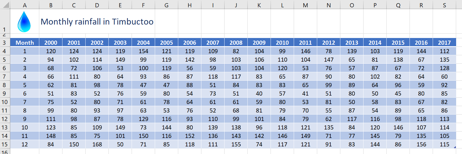
If you tried to plot this data on a conventional column chart or line chart, it would be very congested. Hence the benefits of the XY Scatter Chart.
To create an X Y (Scatter) chart from this data:
1. Select a single cell in your data to select the entire range or select the specific data range you wish to use.
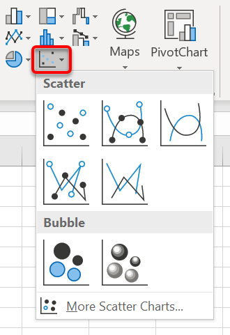
2. Click the Insert tab then the Insert Scatter (X, Y) or Bubble Chart icon in the Charts group, or …
Click the Recommended Charts icon | All Charts tab | X Y (Scatter)
3. Select one of the Scatter options. You can change this later using the Change Chart Type icon on the Chart Tools Design tab.
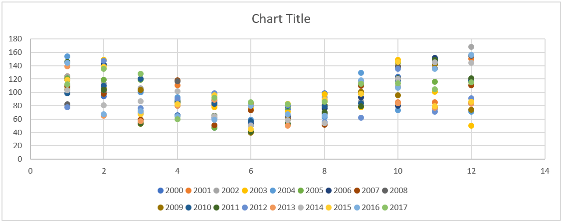
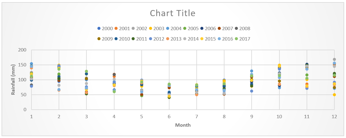
The default Scatter chart for the example above will put …:
1. Years in the Legend
2. Monthly rainfall figures on the vertical axis.
3. Month number on the horizontal axis (if there are labels in the data, they will be ignored on the axis)
This is the initial Scatter chart that Excel provides:
It is always worth checking out the Chart Styles on the Chart Tools Design ribbon for different configurations and colours.

2. Add extra gridlines to help read the data
To add extra gridlines:
1. Click the PLUS icon in chart icon controls on the top-right edge of the chart (or click Add Chart Element on the left of the Chart Tools Design ribbon)
2. Click the Gridlines option arrow, then tick any Major and Minor gridlines for the vertical and horizontal axis that you require.
3. Add the missing numbers on the bottom axis
To add a full complement of numbers on the bottom axis:
1. Click the PLUS icon in the chart icon controls on the top-right edge of the chart (or click Add Chart Element on the left of the Chart Tools Design ribbon)
2. Click the Axes option arrow, then choose More options.
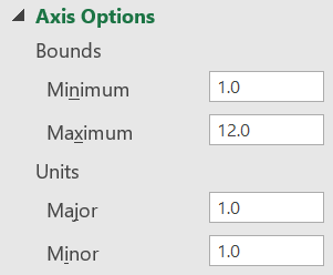
3. On the sidebar set Minimum and Maximum Bounds and the Major and Minor Units.
3. Switch on and customise the vertical axis title
To switch on the vertical axis title/label:
1. Click the PLUS icon in the chart icon controls on the top-right edge of the chart (or click Add Chart Element on the left of the Chart Tools Design ribbon)
2. Click the Axes Titles option arrow, then tick the Primary Vertical box.
3. Click inside the vertical label box then overwrite the default text with your own.
4. Filter the data
To declutter a messy or overpopulated Scatter chart:
1. Click the FILTER icon on the top-right edge of the chart and untick items you wish to exclude.
2. Untick any data that you want to temporarily hide. You can always add this back in later.
3. Click the Apply button at the bottom.
5. Change the month number to a month name
Yeah, I’d like to able to do this too. Unfortunately, it cannot be done (currently). But there is a way to fudge it.
1. Create a line chart which allows you to display the month names as axis labels,
2. Add line markers then and switch off the lines.
The result ends up looking like a scatter chart but I acknowledge it’s by no means a perfect solution..
5. Summary
I hope you found plenty of value in this post. I'd love to hear your biggest takeaway in the comments below together with any questions you may have.
Have a fantastic day.


About the author
Jason Morrell
Jason Morrell is a professional trainer, consultant and course creator who lives on the glorious Gold Coast in Queensland, Australia.
He helps people of all levels unleash and leverage the power contained within Microsoft Office by delivering training, troubleshooting services and taking on client projects. He loves to simplify tricky concepts and provide helpful, proven, actionable advice that can be implemented for quick results.
Purely for amusement he sometimes talks about himself in the third person.
SHARE


