Surface charts allow you to plot your data as a two- or three-dimensional terrain so you can see the overall trend and any anomalies that may be present.
In this post you'll discover that there are 4 different types of Surface Chart and you'll learn how to prepare your data properly, create the chart then apply a number of options to customise and enhance the result.
1. The 4 types of Surface Chart
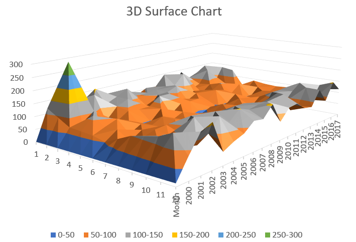
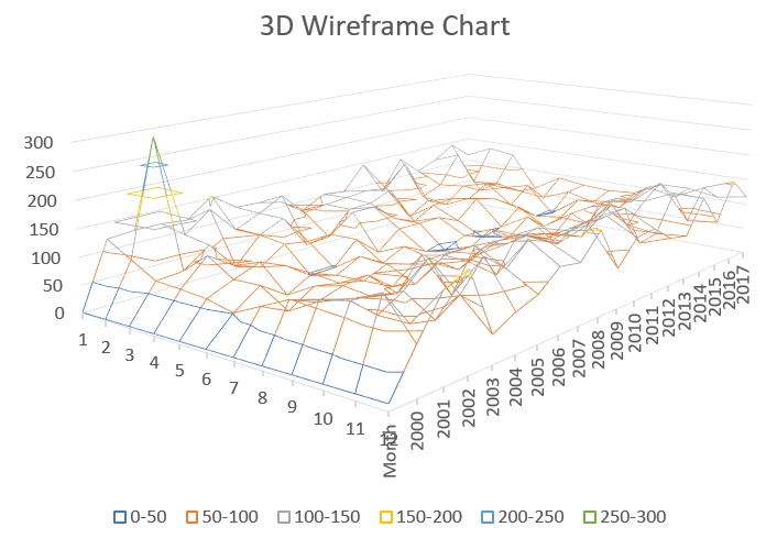
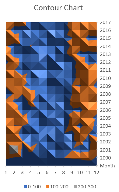
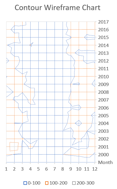
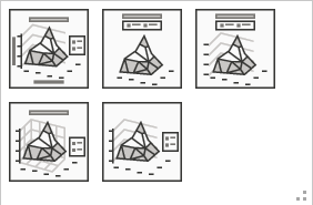
There are 4 different types of surface chart, each representing the data in a different way.
- 3D Surface Chart
- 3D Wireframe Chart
- 2D Contour Chart
- Contour Wireframe Chart
Here what each one looks like:
2. How to create a surface chart
Consider this data which show the annual rainfall in Timbuctoo between 2000 and 2017.
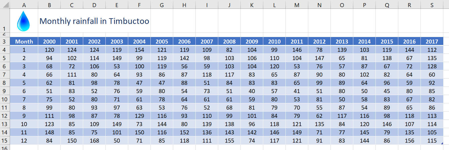
To create a surface chart
1. Select any single cell in your data to allow Excel to auto-select the entire table range, or select only the headings and specific ranges of data you wish to use.
2. Click the Insert tab then the Waterfall, Funnel, Stock, Surface or Radar chart icon in the Charts group, or select Recommended Charts | All Charts | Surface.
3. Click one of the 4 icons to create your choice of surface chart. You can switch later if you wish.

- Each value is colour coded based on its size.
- Values are categorised into numerical buckets (20-30 etc.).
3. How to customise the style or layout
It is always worth checking out the Chart Styles and Quick Layout options on the Chart Design ribbon for different pre-configured chart styles.
4. How to add, remove, hide or show data
To add extra columns/rows of data to the chart:
1. Click the Select Data icon on the Chart Design ribbon.
2. Click the Add button.
3. In the first box, click the appropriate column heading or row label. Or type a name for the new range.
4. Click in the second box then select the new range to add.
5. Click OK .
To remove columns/rows of data from the chart:
1. Click the Select Data icon on the Chart Design ribbon
2. Select the Series or Category that you want to remove.
3. Click Remove then click OK
To hide/show data from the chart:
1. Click the Filter icon in the top-right corner of the chart and untick or tick the items you wish to hide or show.
5. How to switch to a transverse layout
1. Click the Switch Row/Column icon on the Chart Design ribbon.
2. Click it again to toggle back. This swaps the information on the axis with the information in the legend.
6. How to change the surface type
1. Click the Chart Type icon on the Chart Design ribbon. the Surface option will still be selected.
2. Select a new surface type from the main window and click OK.
7. How to add axis titles to a surface chart
1. On the Chart Design ribbon, click Add Chart Element
2. Hover over Axis Titles, click the little right-arrow that appears and then click Primary Horizontal and/or Primary Vertical.
3. Click the default axis title that has been added to the chart then type a new name.
8. How to reverse the direction of surface chart data
To reverse the data (i.e. display 2017 to 2000 instead of 2000 to 2017:
1. Double-click anywhere on the chart to display the sidebar.
2. In the sidebar, click the Options drop-down arrow at the top of the sidebar and select Depth (Series) Axis.
3. Click the 3rd icon (Axis Options) icon (looks like a column chart).
4. Under the Axis Options heading, tick the Series in reverse order box.
9. How to rotate the surface chart sideways, forwards or backwards or set the perspective
1. Double-click the chart wall to display the sidebar.
2. If necessary, in the sidebar, choose Wall Options from the Options drop-down menu.
3. Click the 2nd icon (Effects).
4. Click 3-D Rotation.
5. Set the X Rotation, Y Rotation or Perspective as required.
10. What next?
I hope you found plenty of value in this post. I'd love to hear your biggest takeaway in the comments below together with any questions you may have.
Have a fantastic day.


About the author
Jason Morrell
Jason Morrell is a professional trainer, consultant and course creator who lives on the glorious Gold Coast in Queensland, Australia.
He helps people of all levels unleash and leverage the power contained within Microsoft Office by delivering training, troubleshooting services and taking on client projects. He loves to simplify tricky concepts and provide helpful, proven, actionable advice that can be implemented for quick results.
Purely for amusement he sometimes talks about himself in the third person.
SHARE

