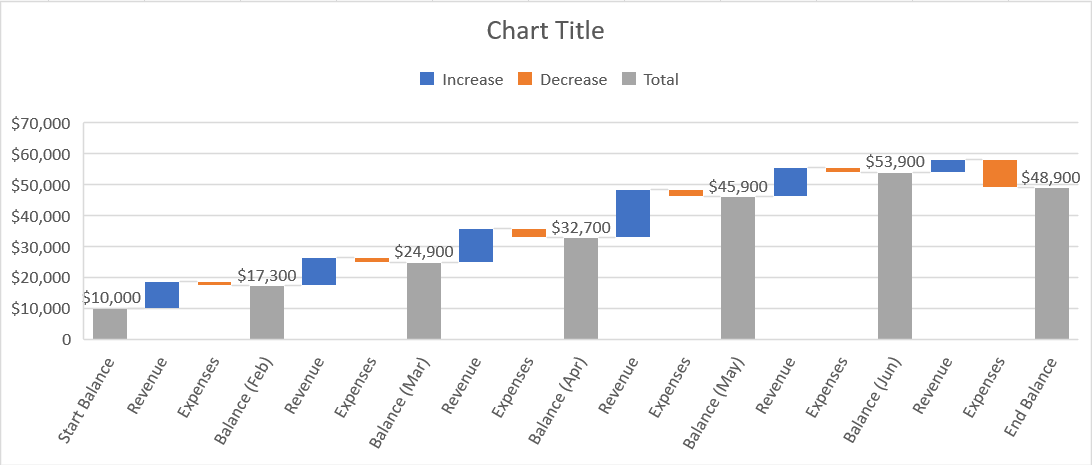
A Waterfall chart (sometimes called a Bridge chart) shows a running total over a period of time as values are added or subtracted. Often this is used to show the net balance over a series of months or years as income and expenses are accounted for.

Each type of column (revenue, expense and balance) on the waterfall chart are colour coded. Normally, the balance is rooted to the horizontal axis while the income and expense figures float.
1. How to set up the data for a waterfall chart
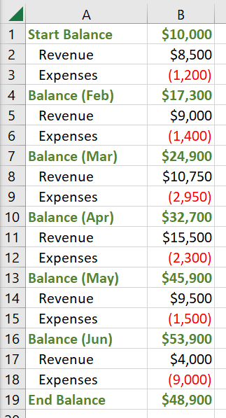
Consider the following balance sheet data:

In between each balance figure there can be one or more positive and/or negative values which represent the activity between each balance point.
2. How to create a Waterfall Chart
1. Select a single cell in your data to select the entire range or select the specific data range you wish to use.
2. Click the Insert tab |
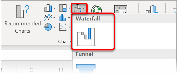
3. Click the Waterfall, Funnel, Stock, Surface, or Radar Chart icon in the Charts group, then choose Funnel.
Alternatively, click Recommended Charts | All Charts tab | Waterfall.

Your initial chart will look similar to this:
![[E2] 08 - 76 chart Waterfall Chart](http://officemastery.com/wp-content/uploads/2020/03/E2-08-76-chart.png)
4. Right-click the last balance column and choose Set as Total. This resets it back to zero (the baseline).
5. Working right-to-left, repeat the previous step for every BALANCE column on the chart.
6. To remove the intermediate labels between each balance, while retaining the columns, click twice (slowly) on each data label then click Delete.
Your chart will now look similar to this.
![[E2] 08 - 77 chart 2 Waterfall Chart](http://officemastery.com/wp-content/uploads/2020/03/E2-08-77-chart-2.png)
The tall grey bars that are grounded on the axis are the cumulative totals. The blue and orange bars in between are the positive and negative events that happened in between.
3. How to change the colours of a waterfall chart
1. On the Page Layout tab, click the Colors button in the Themes group..
2. Click Customize Colors at the bottom.
![[E2] 08 - 78 color Waterfall Chart](http://officemastery.com/wp-content/uploads/2020/03/E2-08-78-color.png)
3. Accent 1, Accent 2 and Accent 3 are the most important as these correspond to the three main colours on the Waterfall chart. Set your preferred accent colours.
4. Type a name for your custom theme.
4. Click OK.
4. Other embellishments for waterfall charts
It is always worth checking out the Chart Styles and the Quick Layouts on the Chart Design ribbon for different configurations and better arrangements of the data..
![[E2] 08 - 79 style Waterfall Chart](http://officemastery.com/wp-content/uploads/2020/03/E2-08-79-style.png)
![[E2] 08 - 80 design Waterfall Chart](http://officemastery.com/wp-content/uploads/2020/03/E2-08-80-design.png)
5. What next?
I hope you found plenty of value in this post. I'd love to hear your biggest takeaway in the comments below together with any questions you may have.
Have a fantastic day.


About the author
Jason Morrell
Jason Morrell is a professional trainer, consultant and course creator who lives on the glorious Gold Coast in Queensland, Australia.
He helps people of all levels unleash and leverage the power contained within Microsoft Office by delivering training, troubleshooting services and taking on client projects. He loves to simplify tricky concepts and provide helpful, proven, actionable advice that can be implemented for quick results.
Purely for amusement he sometimes talks about himself in the third person.
SHARE

