I was recently asked how to create a Renko chart in Excel.
My first question was "What the heck is a Renko chart?" which was quickly answered by the guys at Investopedia. To paraphrase:
"Renko charts were developed by the Japanese to only show price movements, up or down, that are above a certain amount in contrast to standard charts that shows price on one axis and fixed time increments on the other.
Renko (or 'Renga') means brick and the chart looks like a series of bricks. A new brick is created when the price moves a specified price amount. This interval is called the 'box size'. An up brick is typically colored white or green, while a down brick is typically colored black or red."
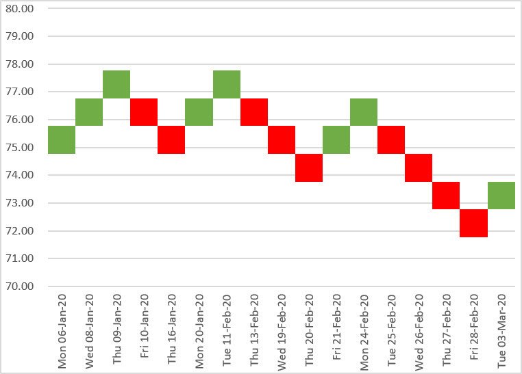
So I gave it a crack and this is the chart I came up with:

In this post I explain how I set up the data and how I created this Renko chart. For some reason, I keep calling it a Jenga chart, so if a 'Jenga' accidently slips in, let me know in the comments!
All right, let's get into it.
Step 1: Have your stock data ready
Here is some example stock data. Unlike a regular stock chart, the open, high and low figures are not required, so the only data used is the Date and the Close price.

Step 2: Get your chart data ready
The 'box size' is key. It defines the size of each up or down block. For flexibility, write the box size value into cell H1 and name the cell Box_Size.

Next, create all the calculation columns required for the Renko chart. These formulas are broken down below.
Notice how the values in column I increase or decrease by exactly 1 (the box size) whenever the close price in column E changes by at least the box size.
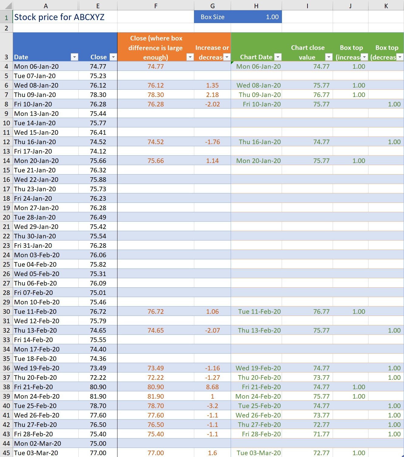
Column F - Identify the close prices that have moved (up or down) by at least the box size
=IF(ABS(E5-INDIRECT("F" & MAX(($F$4:INDIRECT("F" & ROW()-1) <> "") * ROW($F$4:INDIRECT("F" & ROW()-1))))) >= Box_Size, E5, "")
What the formula does::
If the difference between the value in column E and the last populated value in column F is equal or greater than the box size then record the close price, otherwise make the cell blank.
How the formula works:
($F$4:INDIRECT("F" & ROW()-1) <> "")
This part of the formula constructs an array of '1's and '0's. Each cell between F4 and the cell above the current one is checked. A '1' is added to the array if the cell is populated and a '0' is added to the array if the cell is empty.
For example, for cells F5:F10, the array is {0, 1, 1, 1, 0, 0}
ROW($F$4:INDIRECT("F" & ROW()-1))
This part of the formula constructs an array of row numbers for the range between F4 and the cell above the current cell.
For example, for cells F5:F10, the array is {5, 6, 7, 8, 9, 10}
MAX([Value in 1st array] * [Corresponding value in 2nd array])
This part of the formula multiplies the corresponding values of each array , then selects the largest.
For example, for cell F11, multiplying the corresponding values in the 2 arrays {0x5, 1x6, 1x7, 1x8, 0x9, 0x10} gives {0, 6, 7, 8, 0, 0}. Therefore 8 is the largest value which means that row 8 is the last populated cell to this point.
INDIRECT("F" & [Row number of last populated cell])
This part of the formula creates the cell reference for the last populated cell using the row number calculated in the previous step.
ABS(E5-[Value in the cell calculated in last step])
This part of the formula subtracts the value in the last populated cell (identified above) from the close price on the current row. If the result is negative, the sign is removed because it's the difference that is important.
=IF([The Difference] >= Box_Size, E5, "")
If the difference is equal or greater than the box size, record the close price otherwise make the cell blank.
Column G - How big was the increase or decrease?
=IF(F5="", "", E5 - INDIRECT("F" & MAX(($F$4:INDIRECT("F" & ROW()-1) <> "") * ROW($F$4:INDIRECT("F" & ROW()-1)))))
Using the same logic as column F, show the amount of the increase or decrease but only if the difference is equal or greater than the box size.
Column H - Include the date on the chart if there was a sufficient increase or decrease
=IF(F5="", "", A5)
Column I - Increase or decrease the stock value by the box size. Ignore the actual increase or decrease value
=IF(G5="","",IF(G5>0,INDIRECT("I" & MAX(($I$4:INDIRECT("I" & ROW()-1) <> "") * ROW($I$4:INDIRECT("I" & ROW()-1)))) + Box_Size, INDIRECT("I" & MAX(($I$4:INDIRECT("I" & ROW()-1)<>"") * ROW($I$4:INDIRECT("I" & ROW()-1)))) - Box_Size))
If the figure in column G is positive and not blank then find the last populated closing price in column I and add the box price. For example, in cell I6 the last populated closing price is $74.77 in cell I4, therefore I6 is $75.77. For negative figures in column G, the box price is deducted from the last populated closing price.
Column J - If there was a sufficient change upwards, place the box-size value here as the increase value on the chart
=IF(AND(G5<>"", G5>0), Box_Size, "")
If the figure in column G is positive and not blank, put the box size in column I.
Column K - If there was a sufficient change downwards, place the box-size value here as the decrease value on the chart
=IF(AND(G5<>"", G5<0), Box_Size, "")
If the figure in column G is negative and not blank, put the box size in column J.
Step 3: Create a stacked column chart and set chart properties
Step 3a: Create the initial chart
1. Select the chart data (cells H4:K45).
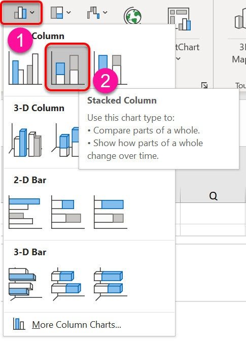
2. Click the Insert tab, click the Column Chart icon, then the Stacked Column icon.
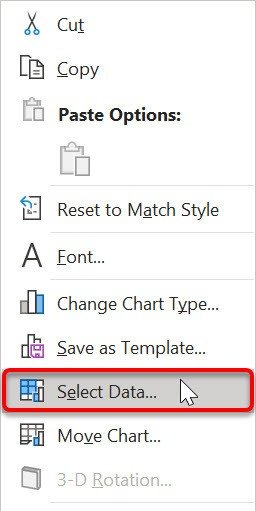
3. Right-click anywhere on the chart and choose Select Data.
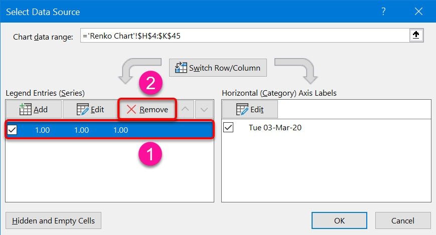
4. In the Select Data Source dialog click on the default entry in the Legend Entries (Series) box, then click theRemove button. This provides a clean start.
5. Click the Add button under Legend Entries to open the Edit Series dialog.
6. Click in the Series Name box, then click cell I3 (Chart Close Value heading).
7. Click in the Series Values box, delete the current entry then select range I4:I45 (Chart Close Value data).

8. Click the Add button under Legend Entries to open the Edit Series dialog.
9. Click in the Series Name box, then click cell J3 (Increase heading).
10. Click in the Series Values box, delete the current entry then select range J4:J45 (Increase data).
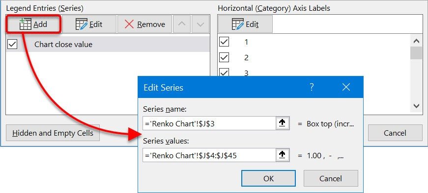
11. Click the Add button under Legend Entries to open the Edit Series dialog.
12. Click in the Series Name box, then click cell K3 (Decrease heading).
13. Click in the Series Values box, delete the current entry then select range K4:K45 (Decrease data).
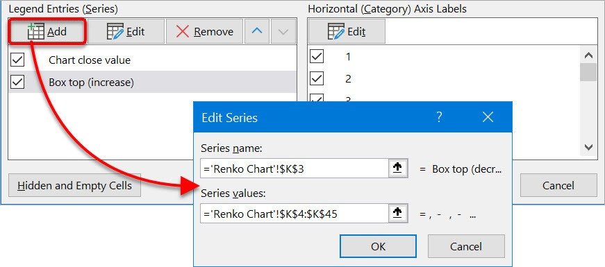
14. Click the Add button under Horizontal (Category) Axis Labels to open the Axis Labels dialog.
16. Click in the Axis Label Range box, delete the current entry then select range H4:H45 (Dates).
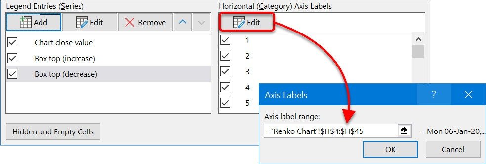
The Select Data Source dialog should now look like this:
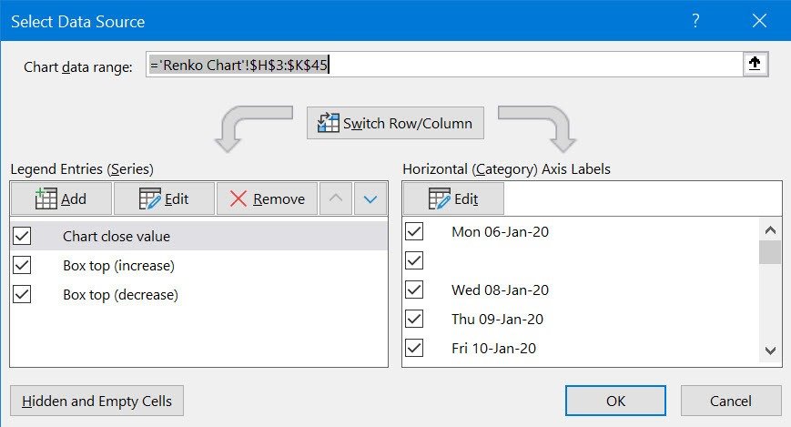
17. Click OK.
The initial chart should look like this:

Step 3b: Modify the chart properties
Change the axis scale
1. Right-click on the chart axis and choose Format Axis from the context menu.
2. In the sidebar, under Axis Options, set the Minimum and Maximum Bounds.

Remove the gaps between the columns and make the base bars invisible
3. Left-click any of the (blue) bottom bars. All the bottom bars will be selected.
4. Right-click any bottom bar and choose Format Data Series from the context menu.
5. Click the Series Options icon (looks like column chart) then set the Gap Width to 0%.
6. Click the Fill icon (looks like a paint bucket) then choose No Fill.

Set the up and down bar colours
7. On the chart, left-click any UP bar to select them all.
8. On the sidebar, which should still be showing the Series Options, set the Fill colour to green or white
9. On the chart, left-click any DOWN bar to select them all.
10. Set the Fill colour to red or black.

Change the dates on the bottom axis to text so empty dates can be hidden
11. Right-click on any date on the bottom axis and choose Format Axis from the context menu.
12. Change the Axis Type to Text Axis.

Hide empty dates
13. On the table, click the filter button for the Date in column H and untick/uncheck the (Blanks) check box.

Once these steps have been completed, your Renko chart will look like this.
I hope you found plenty of value in this post. I'd love to hear your biggest takeaway in the comments below together with any questions you may have.
Have a fantastic day.


About the author
Jason Morrell
Jason Morrell is a professional trainer, consultant and course creator who lives on the glorious Gold Coast in Queensland, Australia.
He helps people of all levels unleash and leverage the power contained within Microsoft Office by delivering training, troubleshooting services and taking on client projects. He loves to simplify tricky concepts and provide helpful, proven, actionable advice that can be implemented for quick results.
Purely for amusement he sometimes talks about himself in the third person.
SHARE


Hi ! This post solves the problem which i was looking for since last 3 months. Though i find a small error which can be modified. If we increase the box size by 2 instead of one it shows a gap in between a cell. Which is majorly because we have taken time into account if this can be modified it can be very helpful for backtesting
In the example provided, click the filter in the Chart Date column. The (blanks) check box is already unchecked so just click OK. This will update the table and the chart.